


— P a c k a g i n g s o l u t i o n —
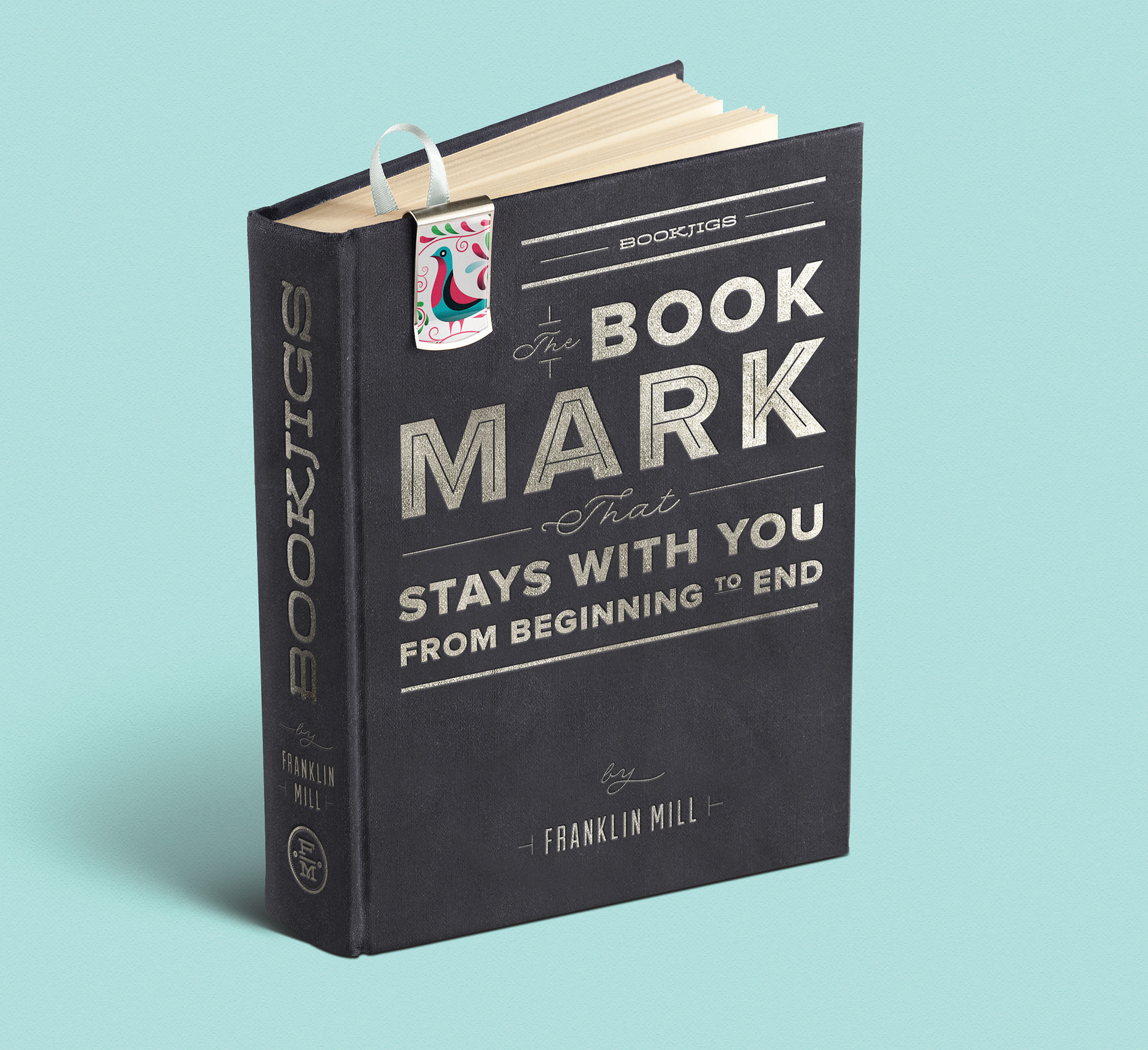
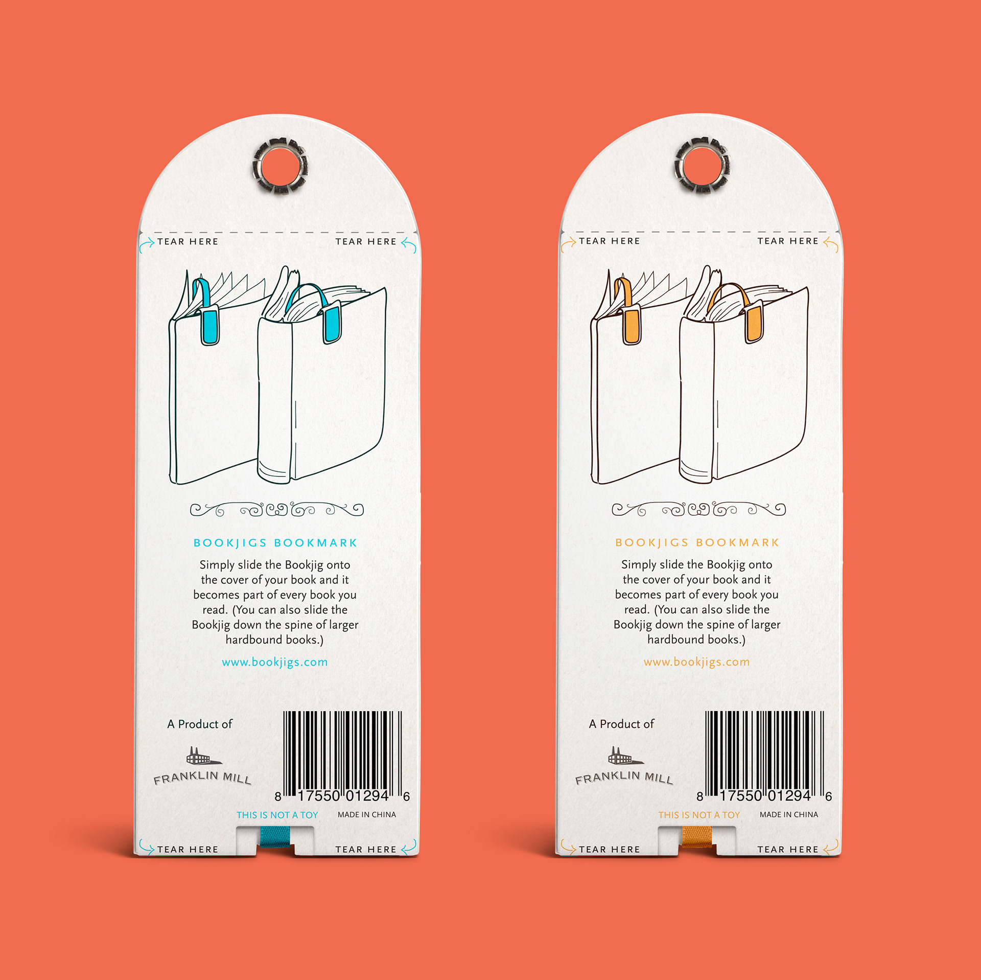
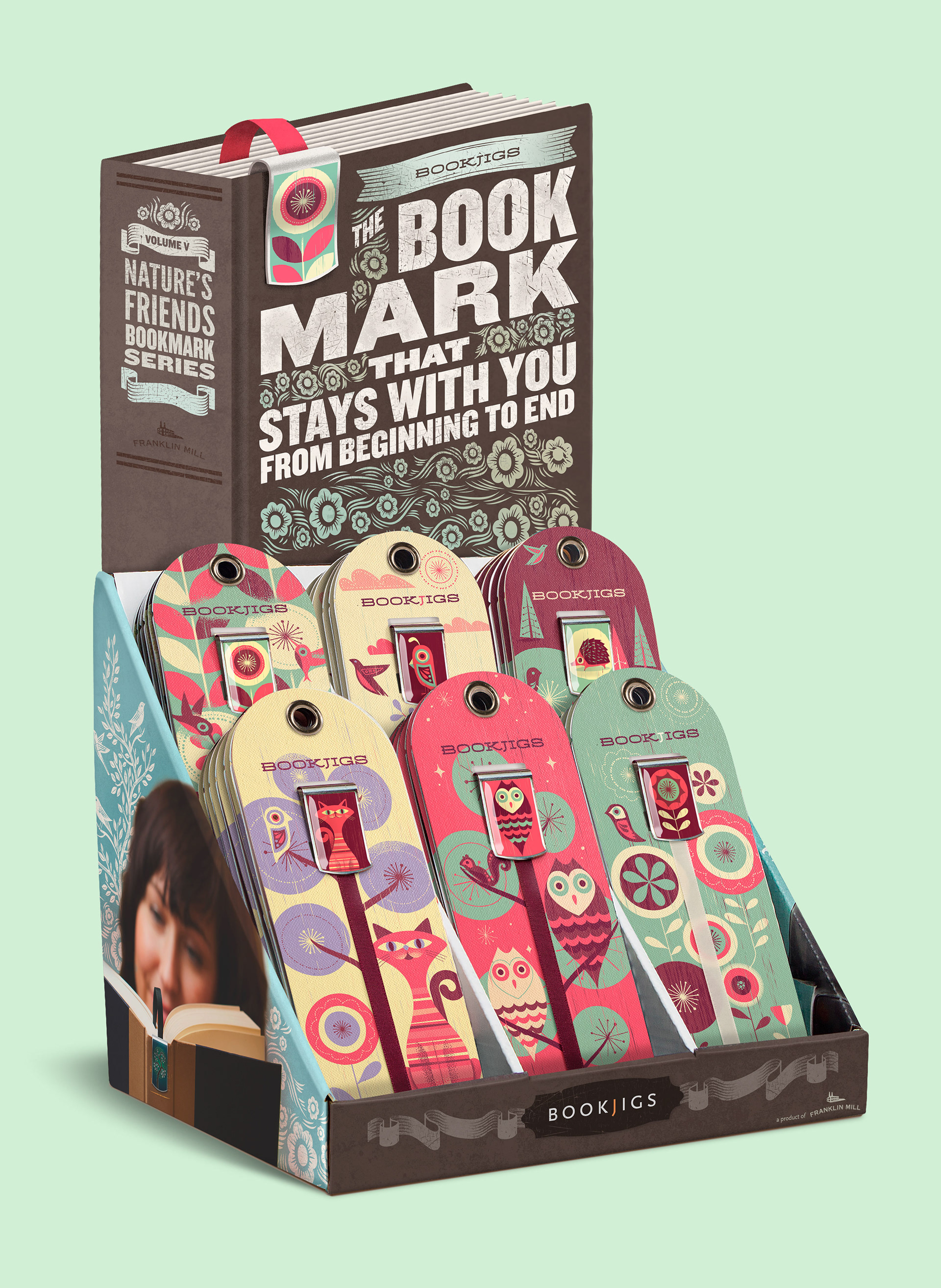
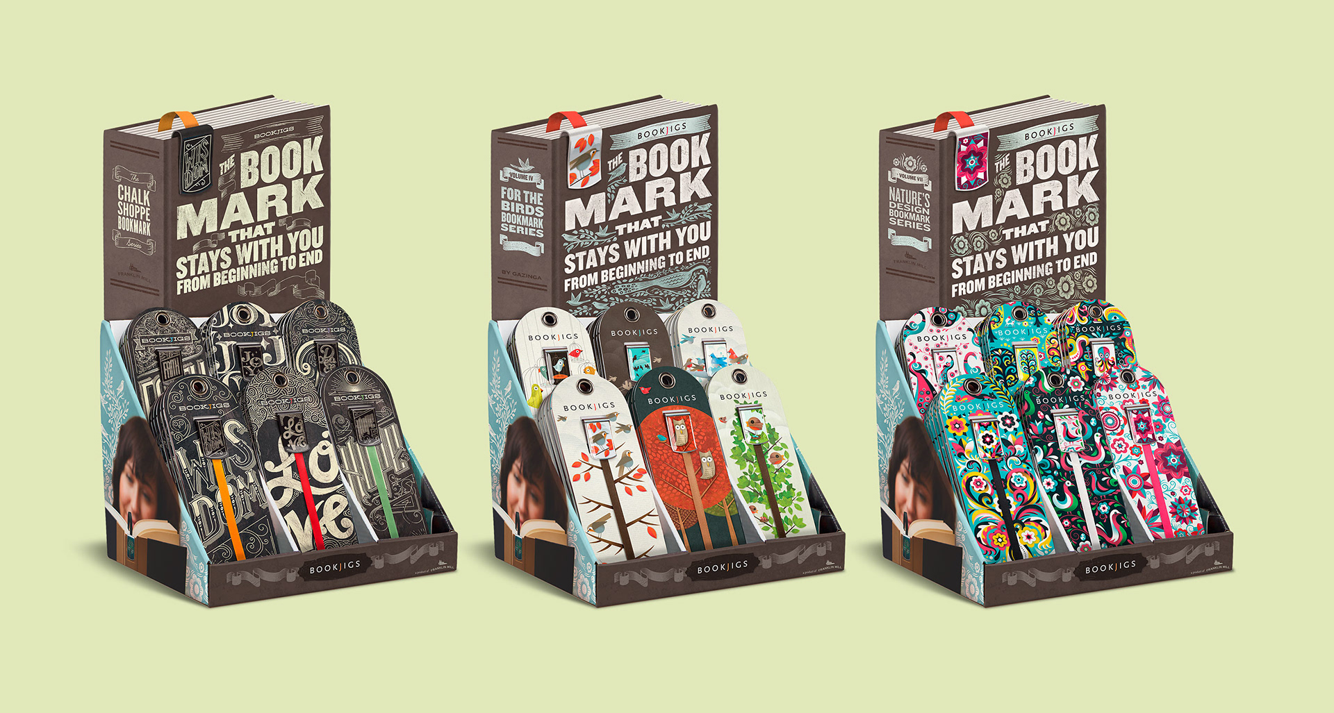
As we developed the initial branding, we felt we needed a way to display the ribbon in the packaging. The ribbon is what sets this bookmark apart from any other. I grabbed some thick paper, and began cutting and folding, trying to find a way to display the ribbon while securing and protecting the product.
Telling a Story
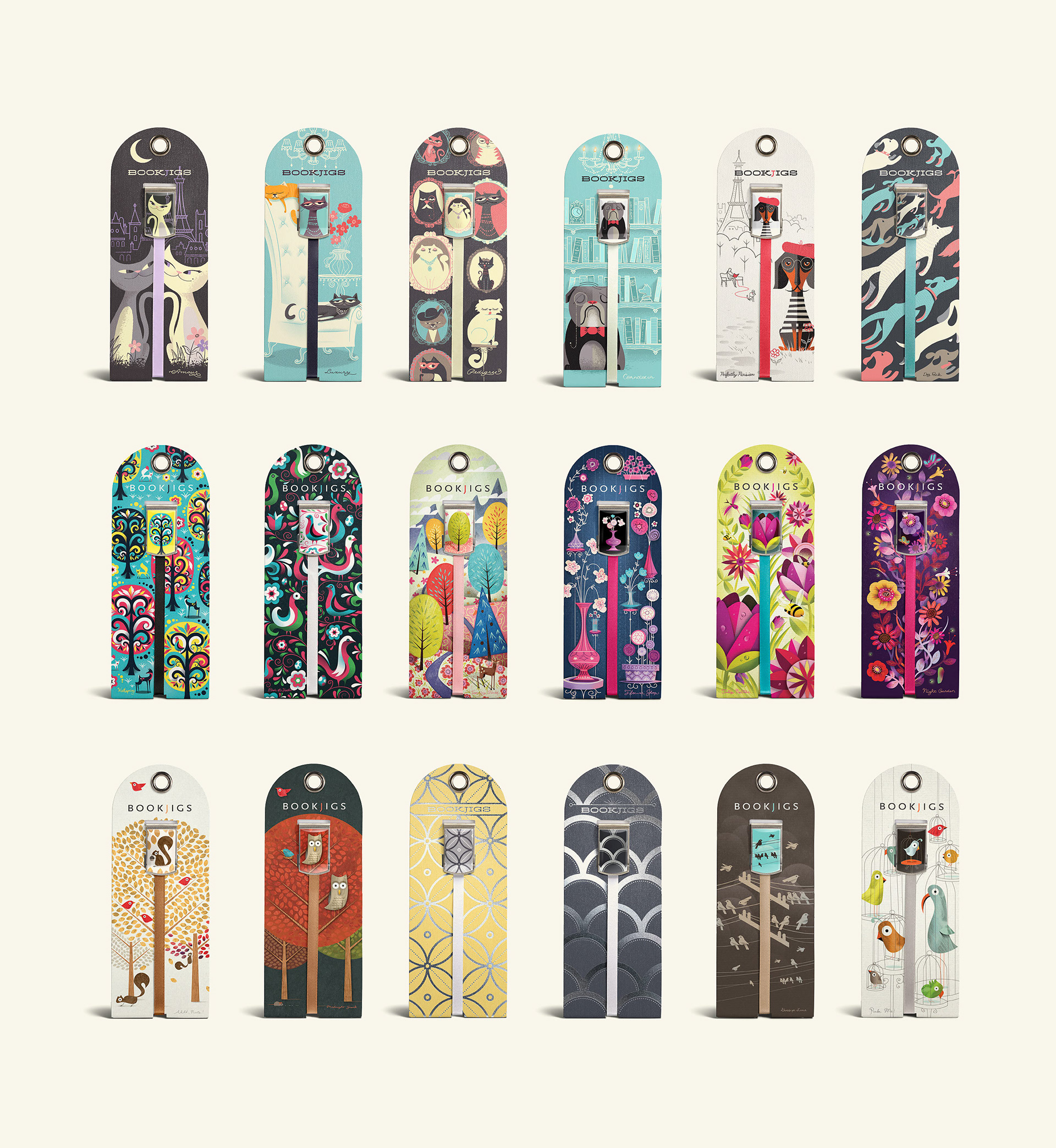
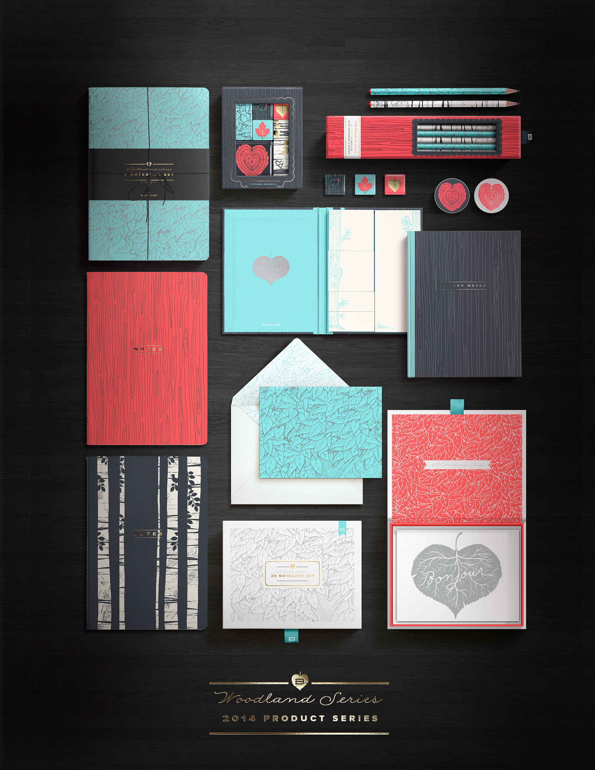
Bookjigs are for passionate readers. Narrative, story, and a sense of playfulness is a part of the Bookjigs brand. Illustration became an integral part of the Bookjigs brand from the start. I often tried to include a little humor or sense of story subtly within the illustrations — a mouse scurries after a trail of seeds, evading the watchful eyes of an owl (titled "Midnight Snack"); caged birds in a pet shop stare anticipatingly at the viewer while a small one in the background hops up and down, flapping and chirping (titled "Pick Me"). Some even integrate the ribbon into the illustration. Each package also features a hand-written monoline title.

The packaging did a great job of making the product stand out. However, a Bookjig is a unique concept that is not easily understood at first glance. We needed a way to demonstrate what the product does. I felt the in-store display would provide the perfect opportunity to demonstrate the utility of the product, and came up with this illustrated display as a solution.
— e x p a n d i n g t h e b r a n d b e y o n d b o o k m a r k s —
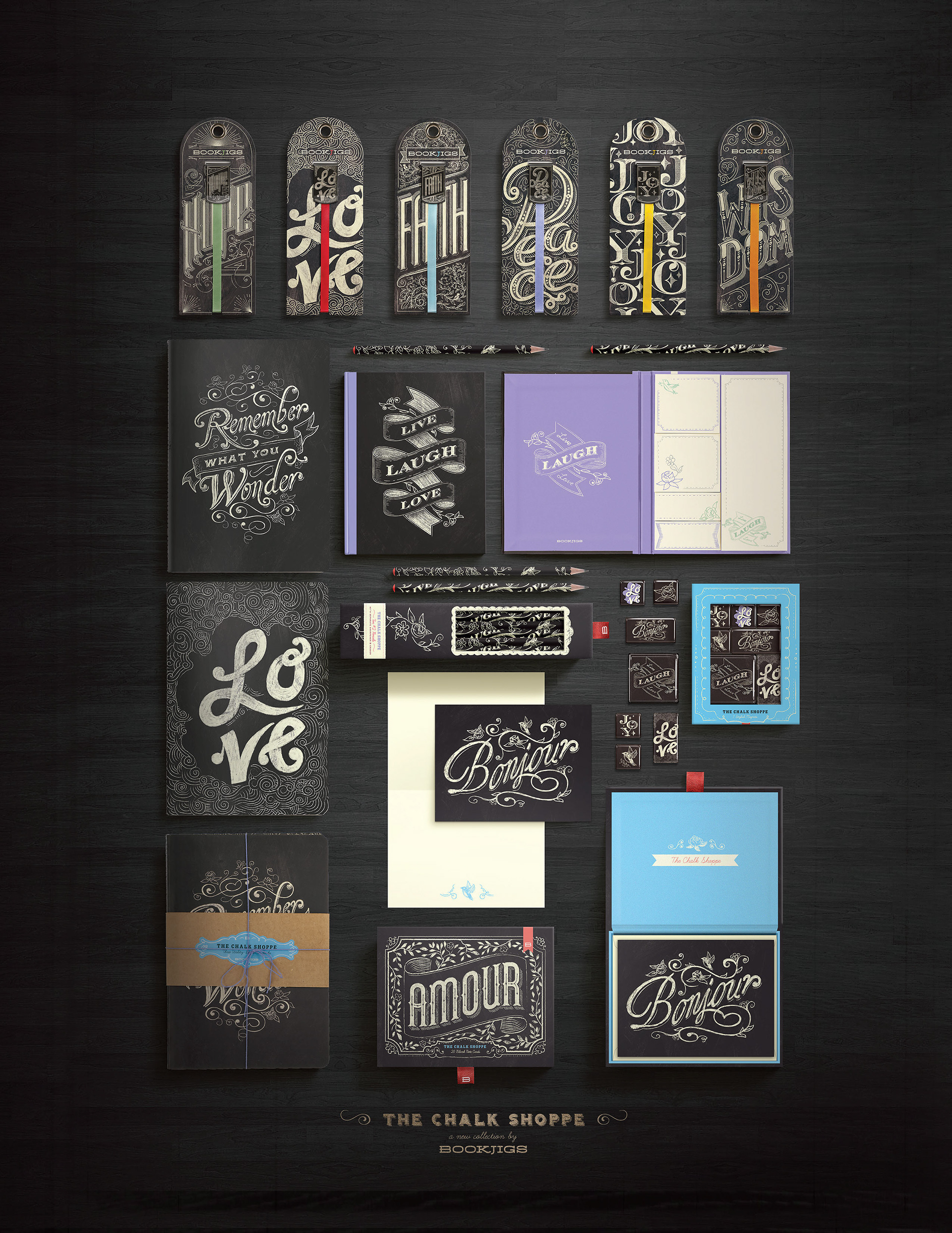
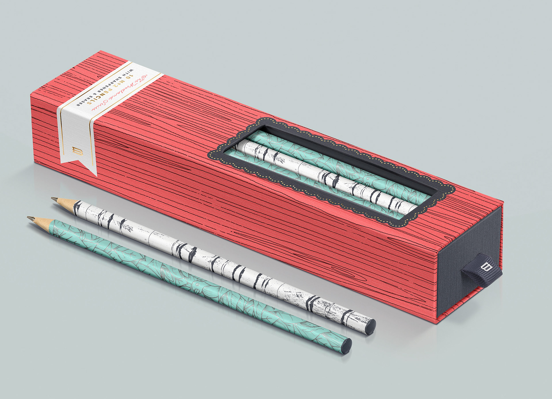
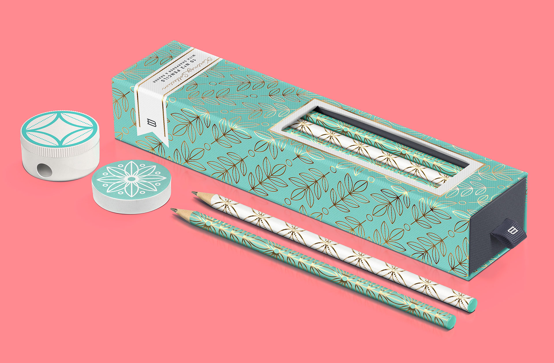
With the success of the bookmarks, the founders wanted to offer more products than bookmarks. I was brought on board to help develop the new Bookjigs brand and product line. During my short time with the company, we launched several new product lines, primarily targeted to smaller boutique shops (but also including Barnes and Noble, Books a Million, and Chapters/Indigo of Canada). As the one-man design team, I also needed to oversee production in China.
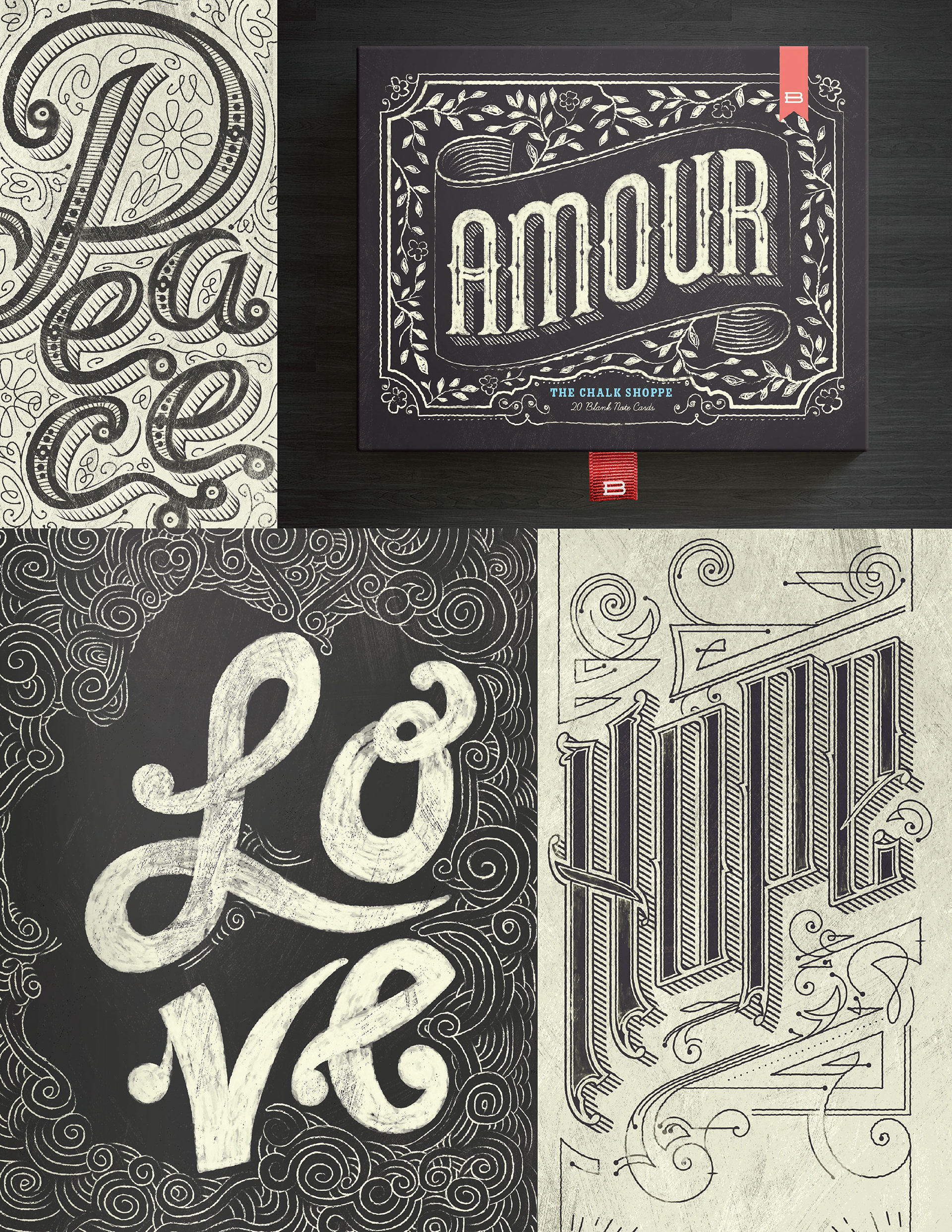
I also designed a tradeshow booth, which was entirely custom built. It needed to be unique, like the product, but be easy to assemble, and ship. Each wall is made of 4 foot wide panels of white-washed wood. The furniture featured LED lighting, aiding visibility in somewhat dimly lit trade-show venues. And of course, as chalk art was popular at the time, I got to try my hand at some chalk lettering.


I re-designed the Bookjigs Shopify web-store, and created an email campaign for past customers, as well as a small friendly campaign of postcards targeted to stores who had fallen off our distribution lists.

