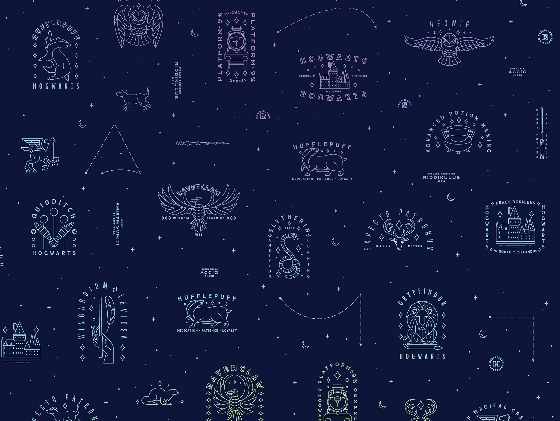
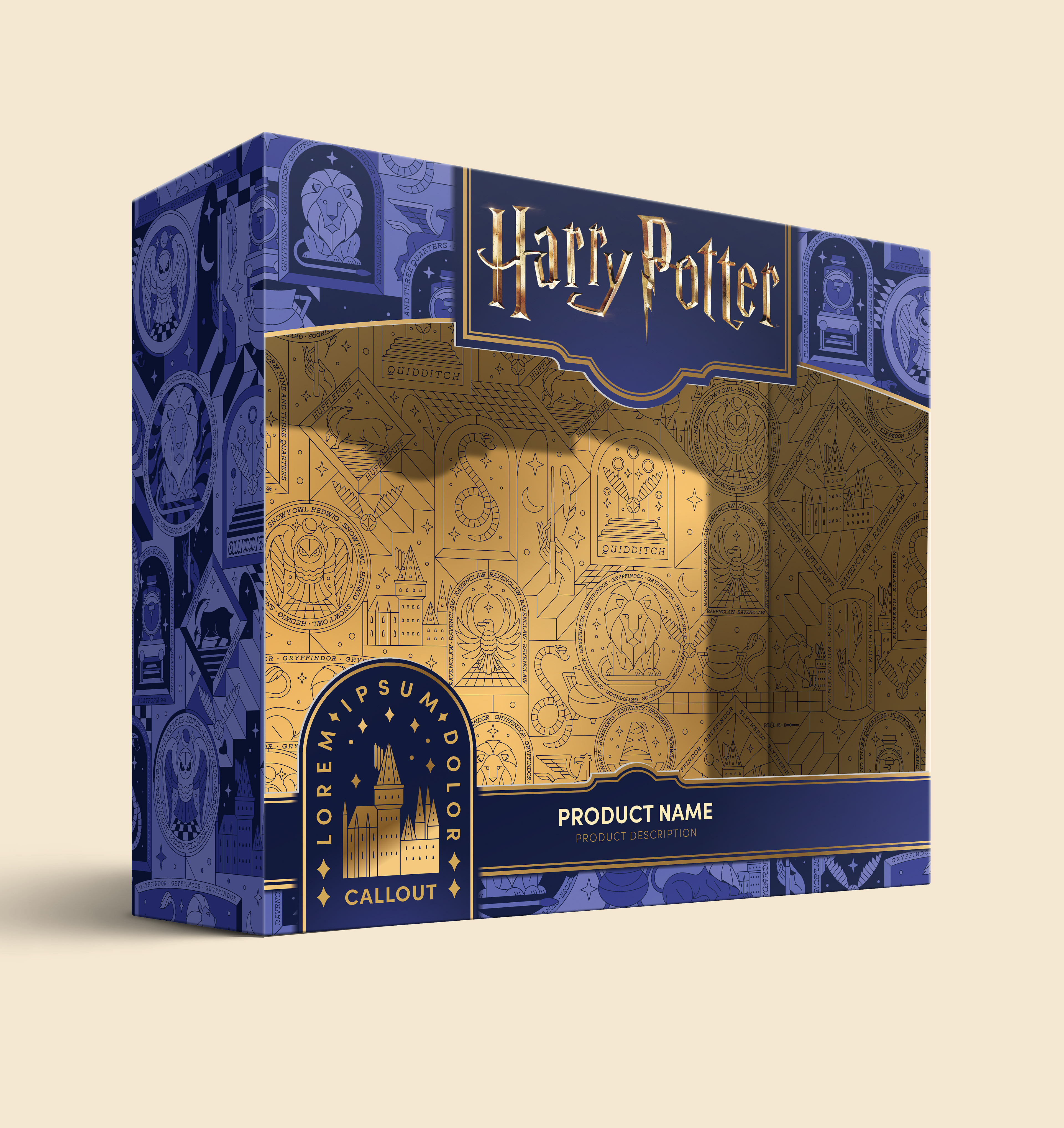
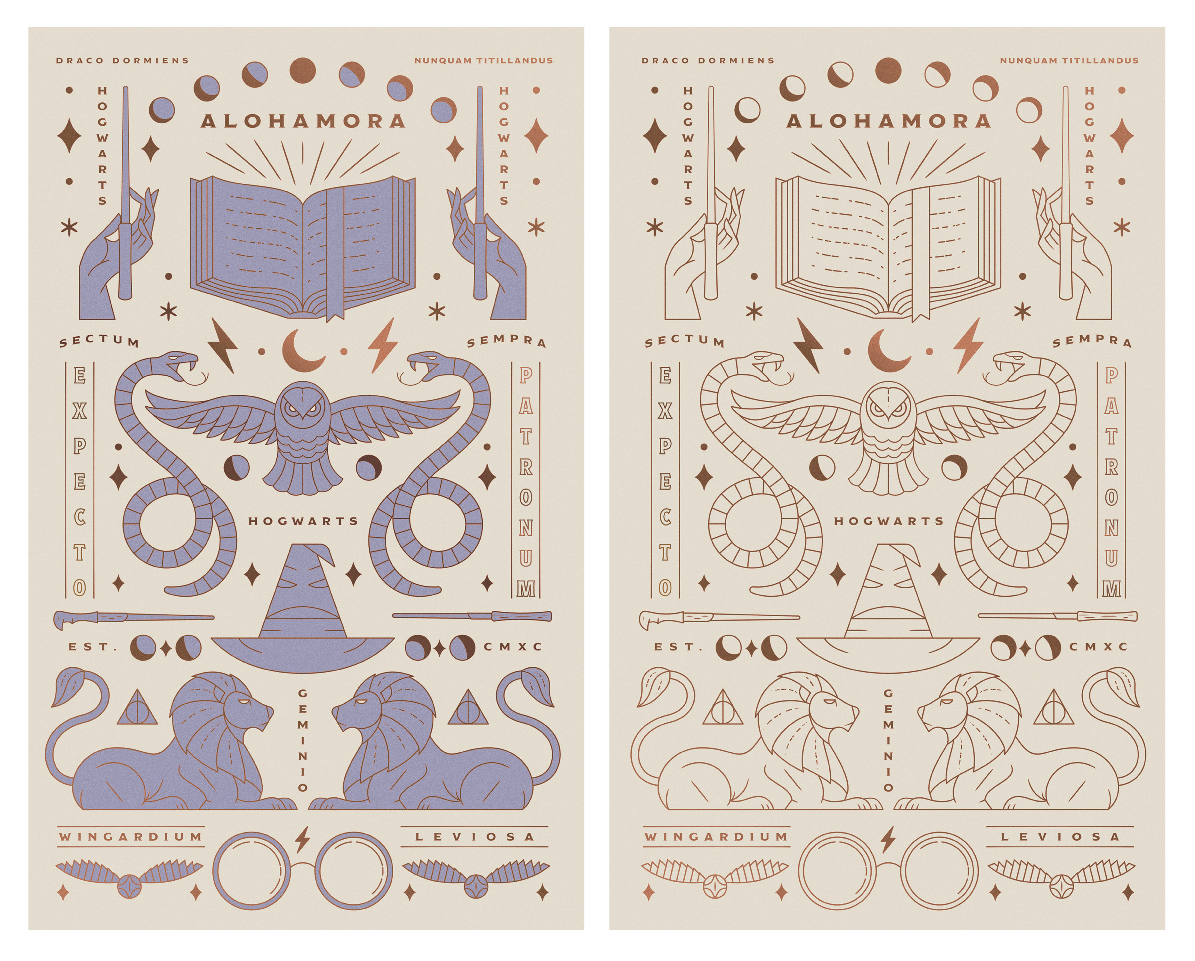
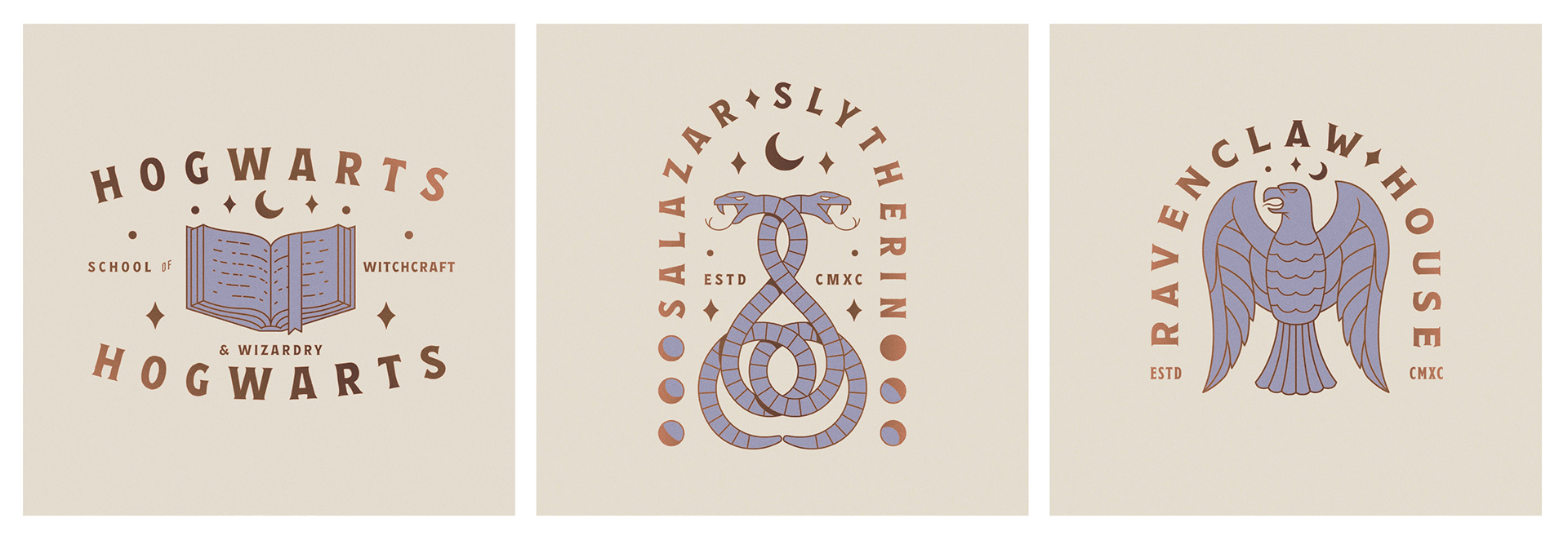
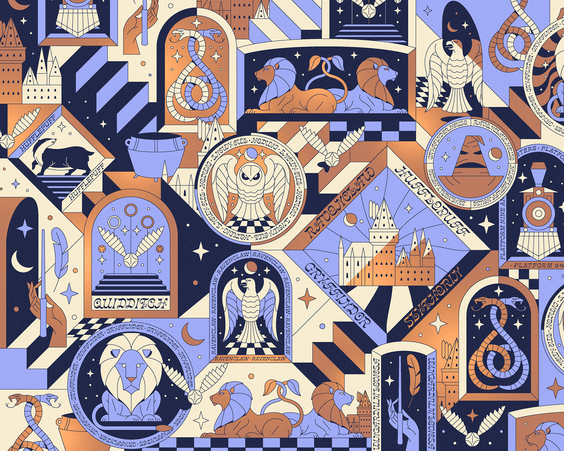
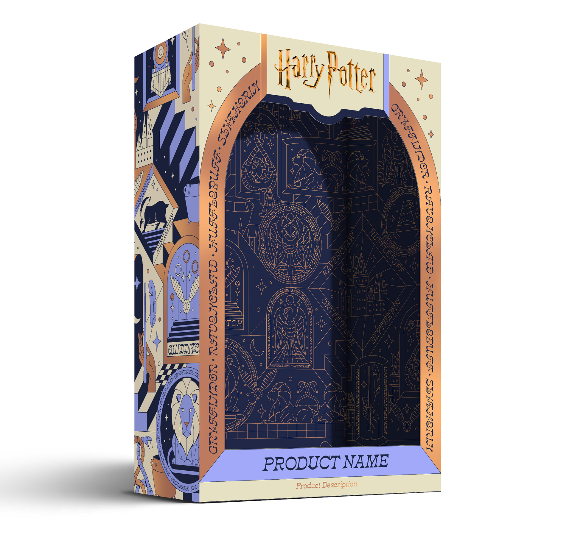
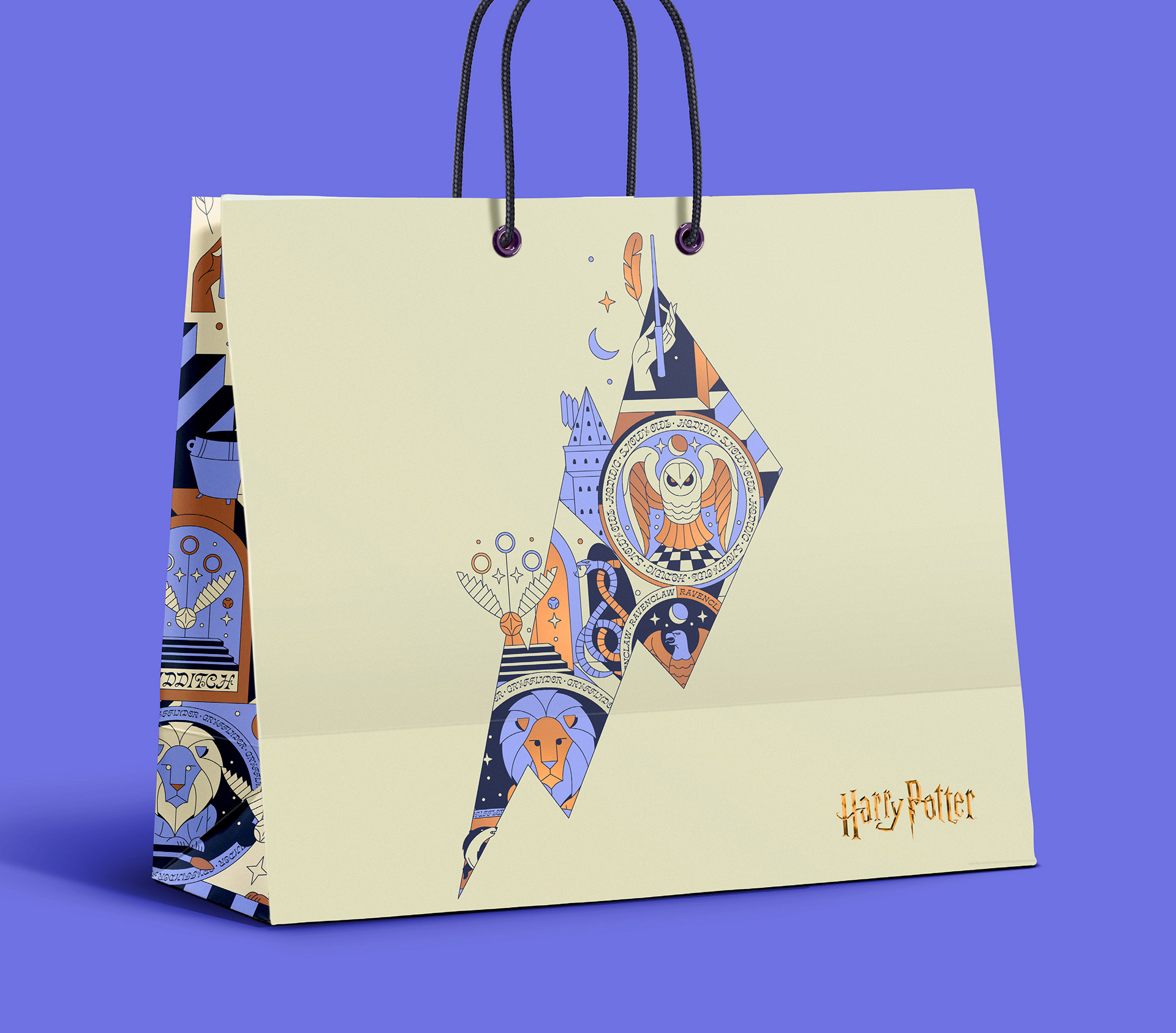
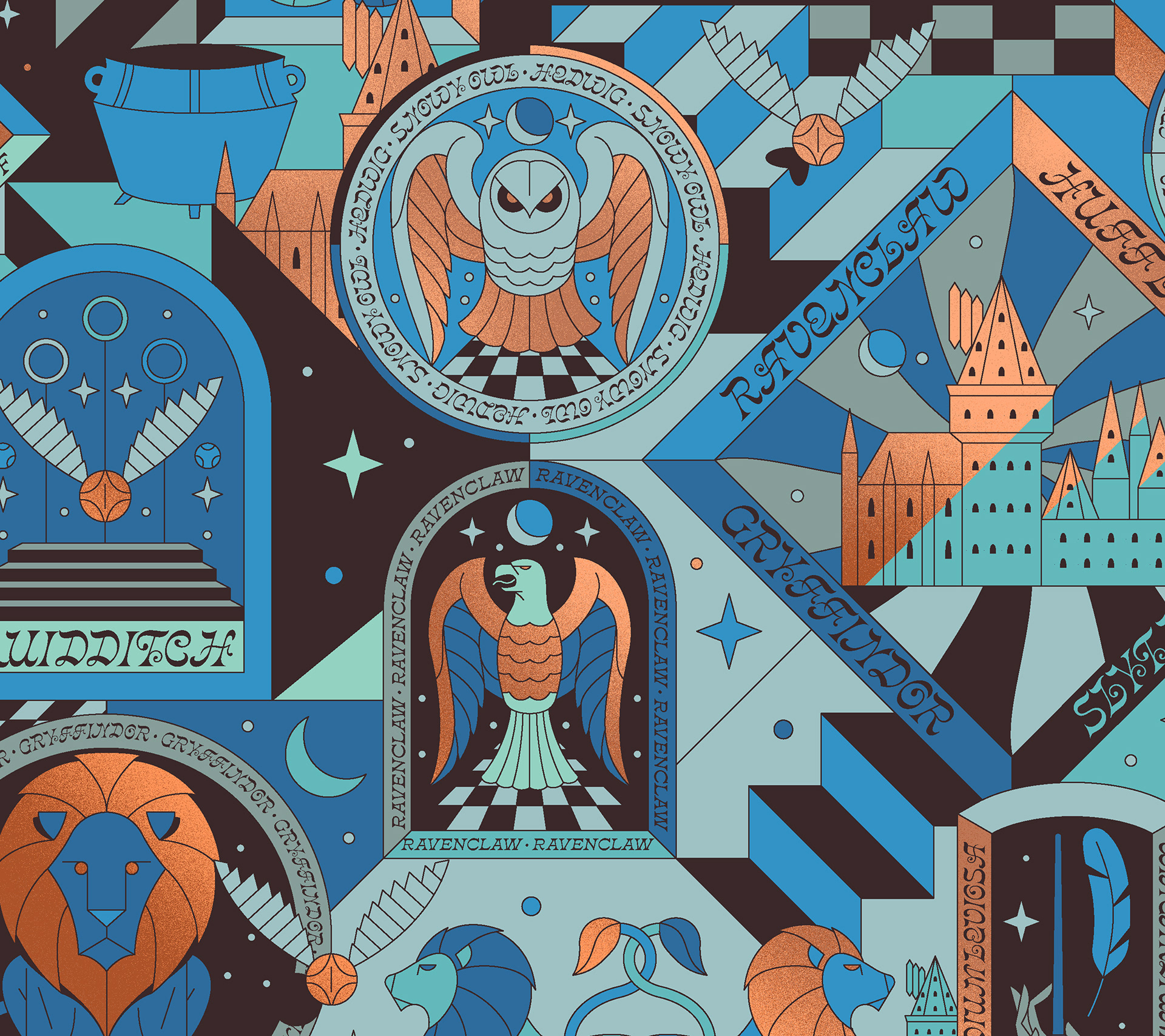
This was a fun project completed in 2024 for my friends at Mattson Creative. The ask was to create patterns and icons to be used for Harry Potter's global product packaging. The request was for artwork which felt tied to past packaging systems, while feeling modernized. The client wanted a series of "badge"-like icons representing various aspects of the Harry Potter world. Patterns were then created using the individual badges, allowing for a flexible packaging system that could be applied across multiple applications. Though multiple color programs were explored throughout the process, in the end, purple and gold became the overall preferred brand color story, rather than the four house colors. As usual, all elements shown here are items I created as part of this project. (I generally don't show work created by colleagues, not wanting to mislead by showing work I did not do!)
Client: Mattson Creative and Warner Brothers // Creative Director: Ty Mattson // My Role: Concepting, Design and Illustration
C O N C E P T N U M B E R 1
The first concept was an effort to maintain some equity from the previous Harry Potter packaging system, with a similar look, but with new badges and type treatments combined into patterns that could be applied in multiple ways in packaging applications. The color we wanted Harry Potter to own was purple (with antique gold accents). But for this direction I opted for a more unexpected shade of purple to give this more of a modern rather than overtly antique look.
C O N C E P T N U M B E R 2
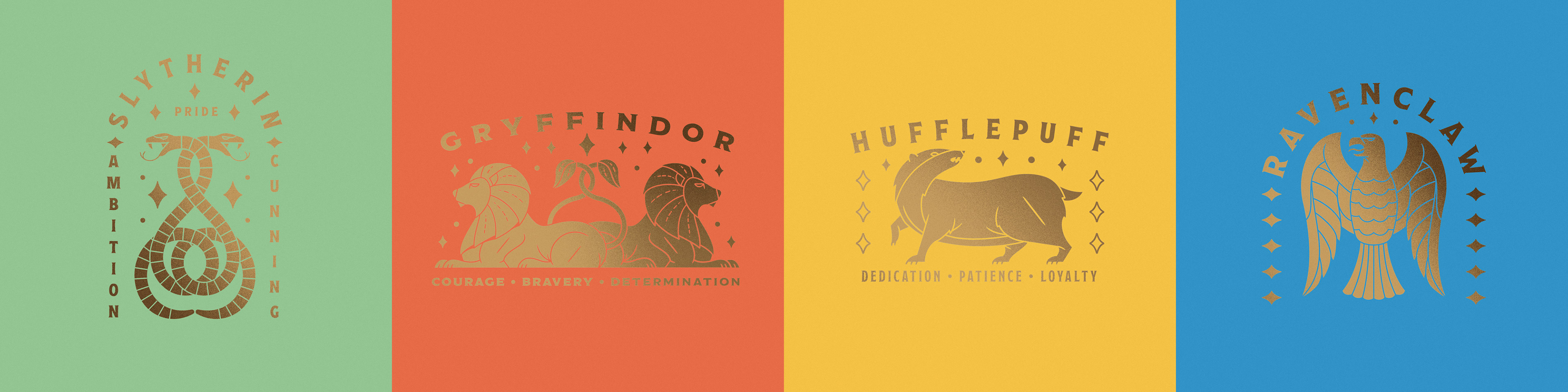
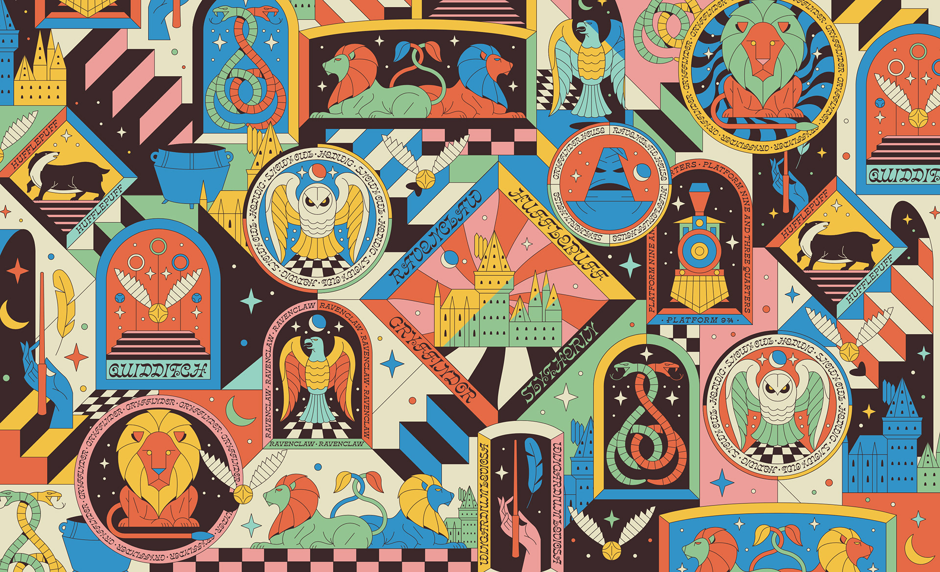
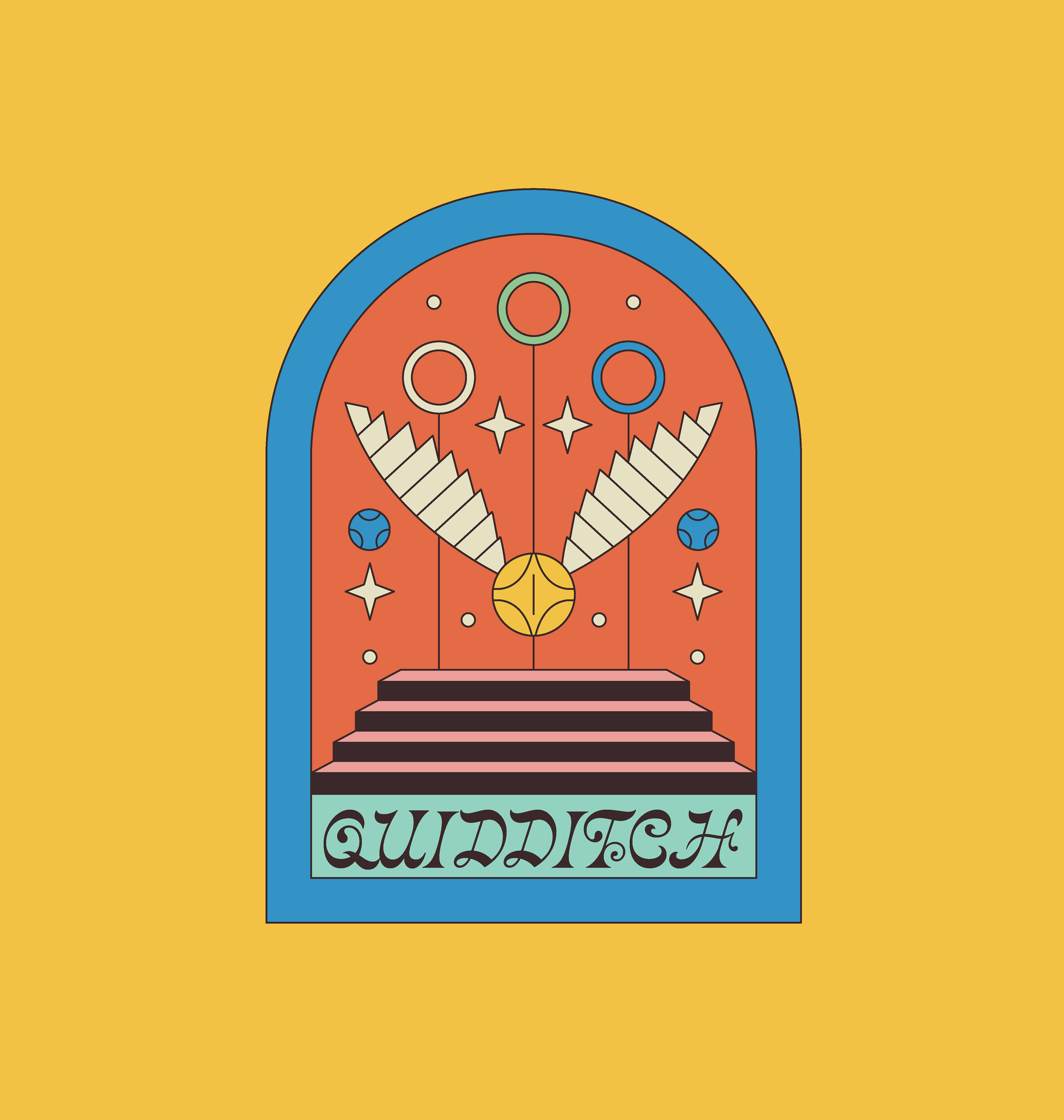
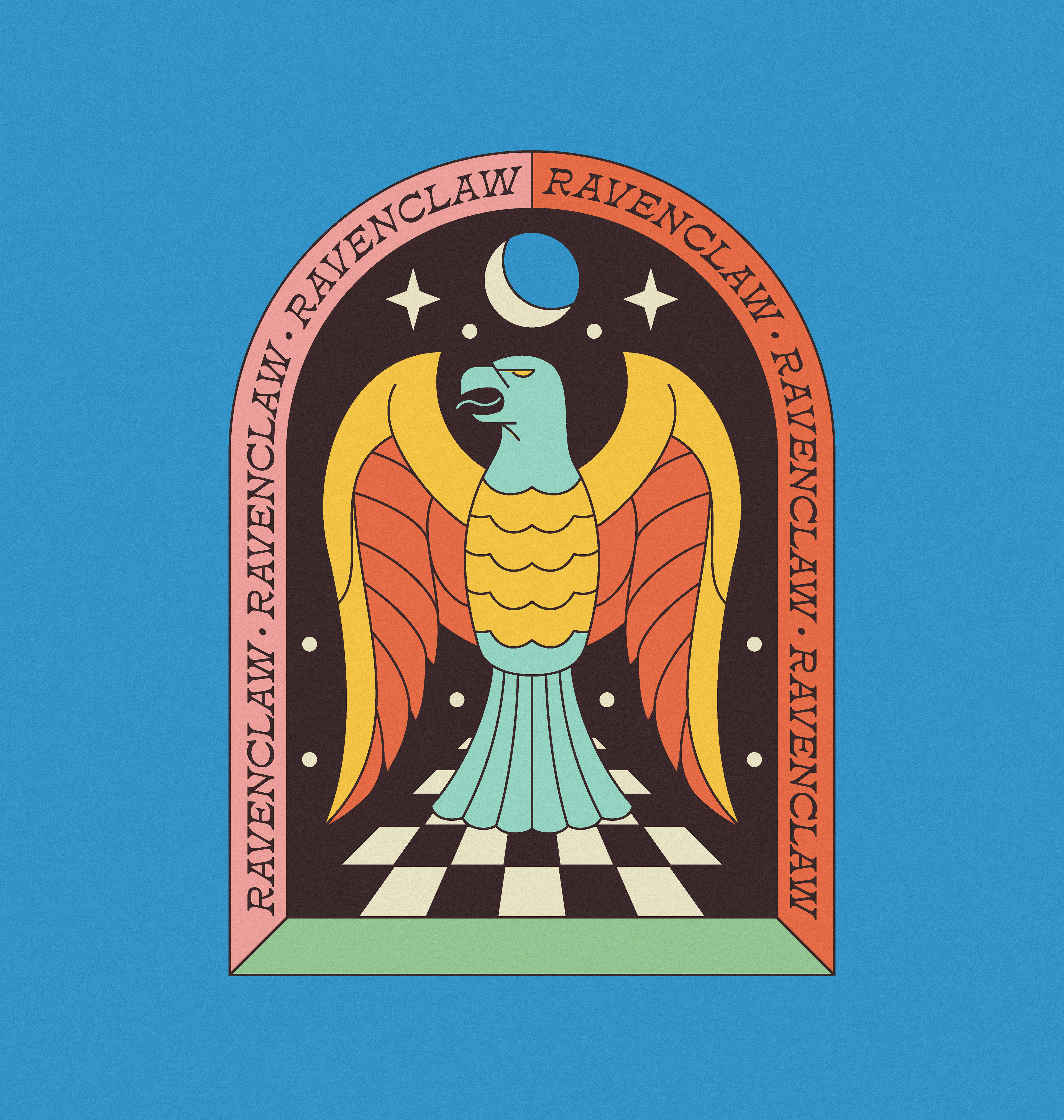
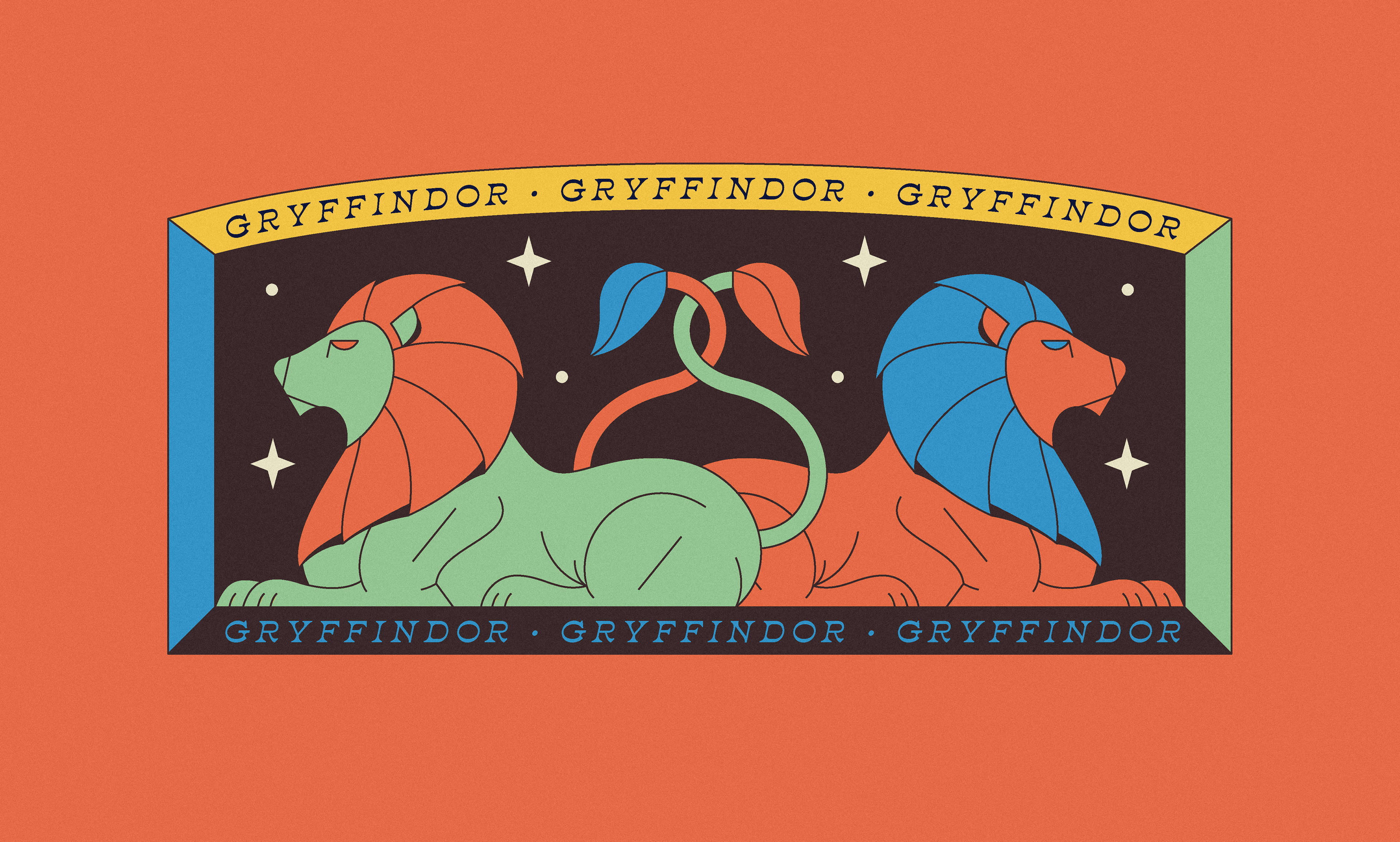
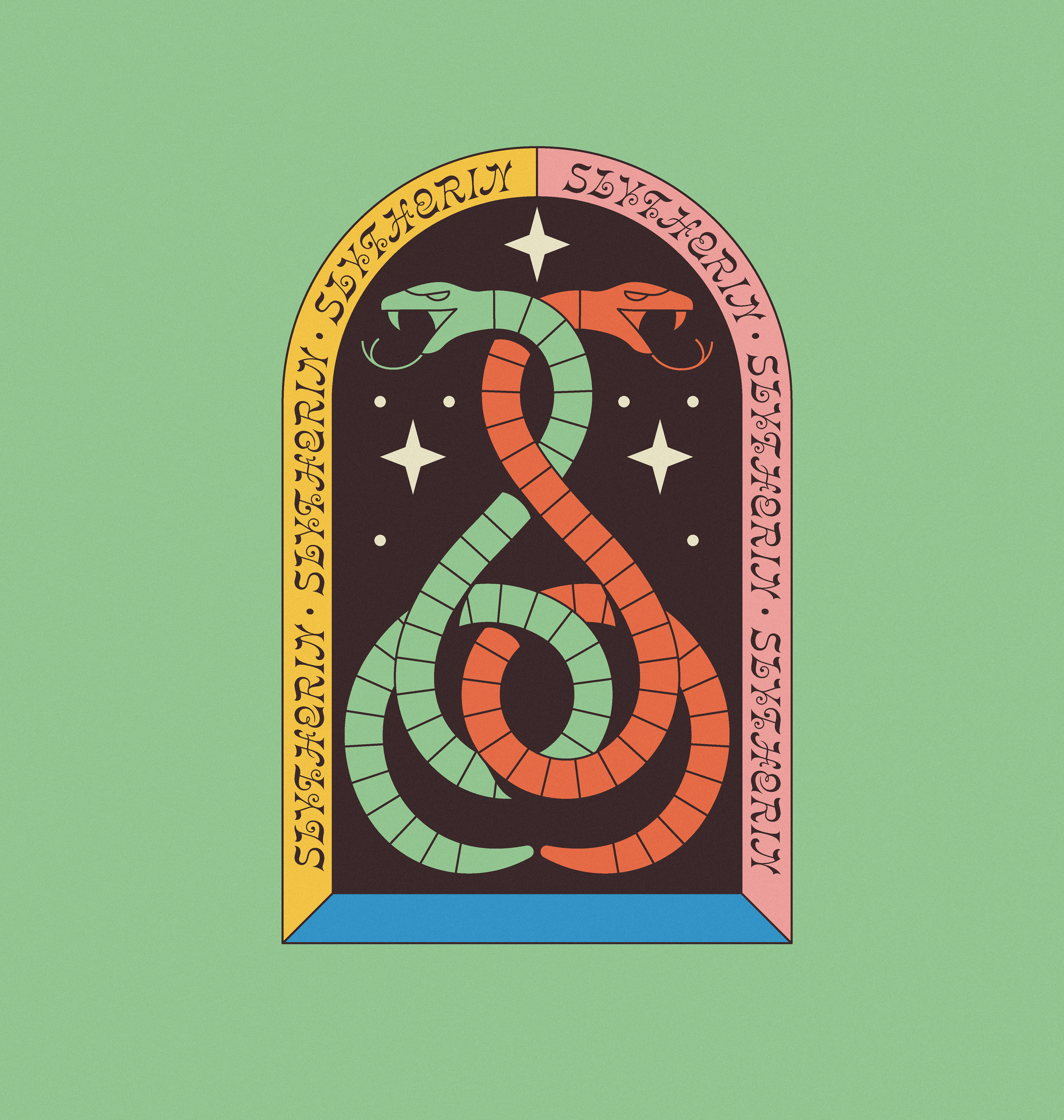
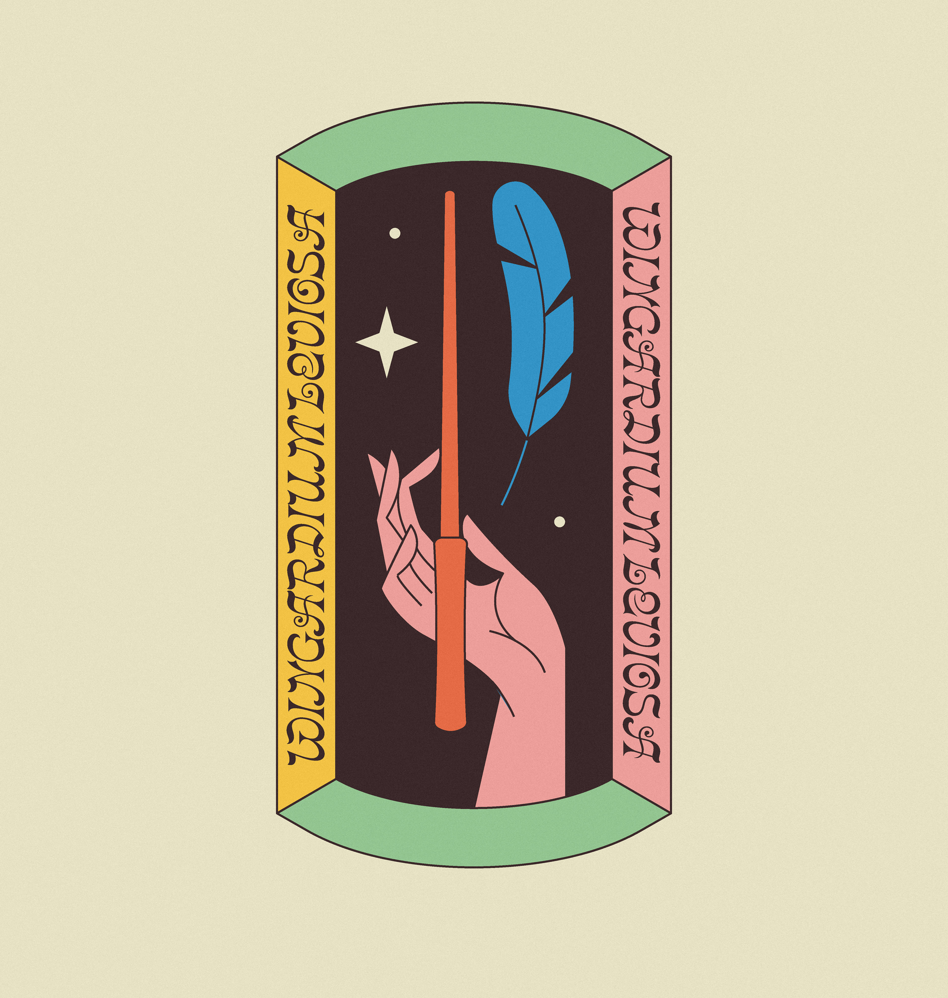
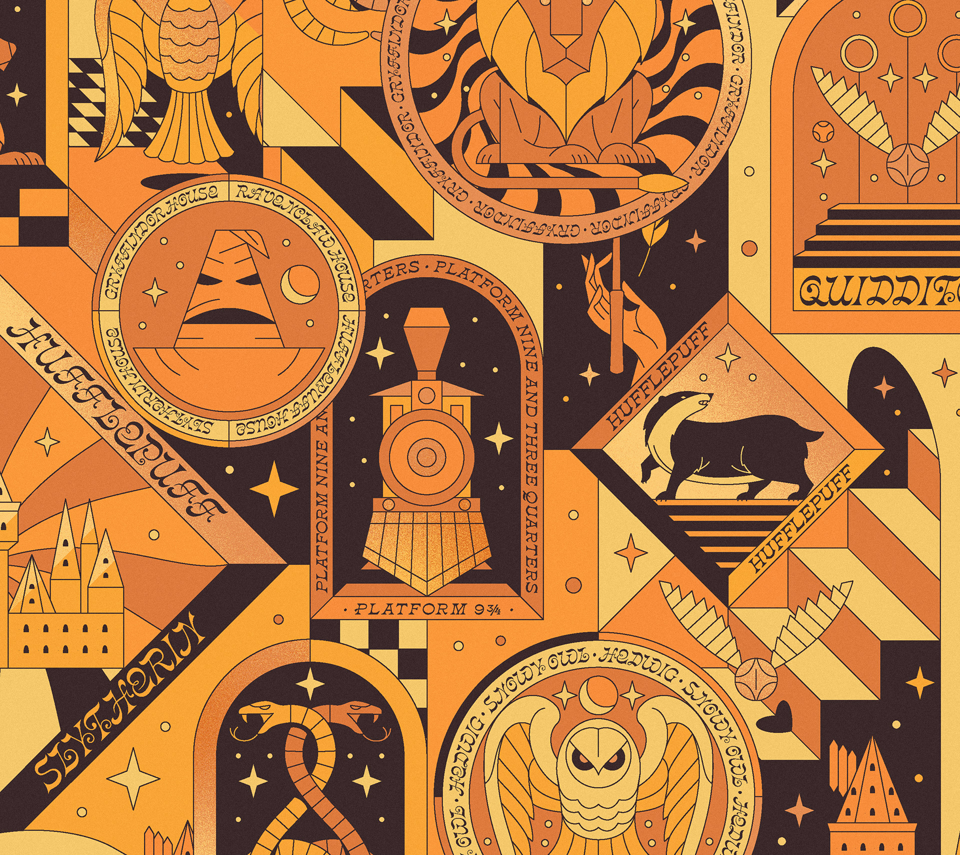
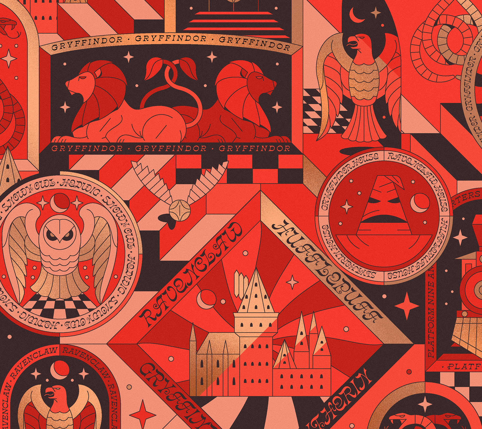
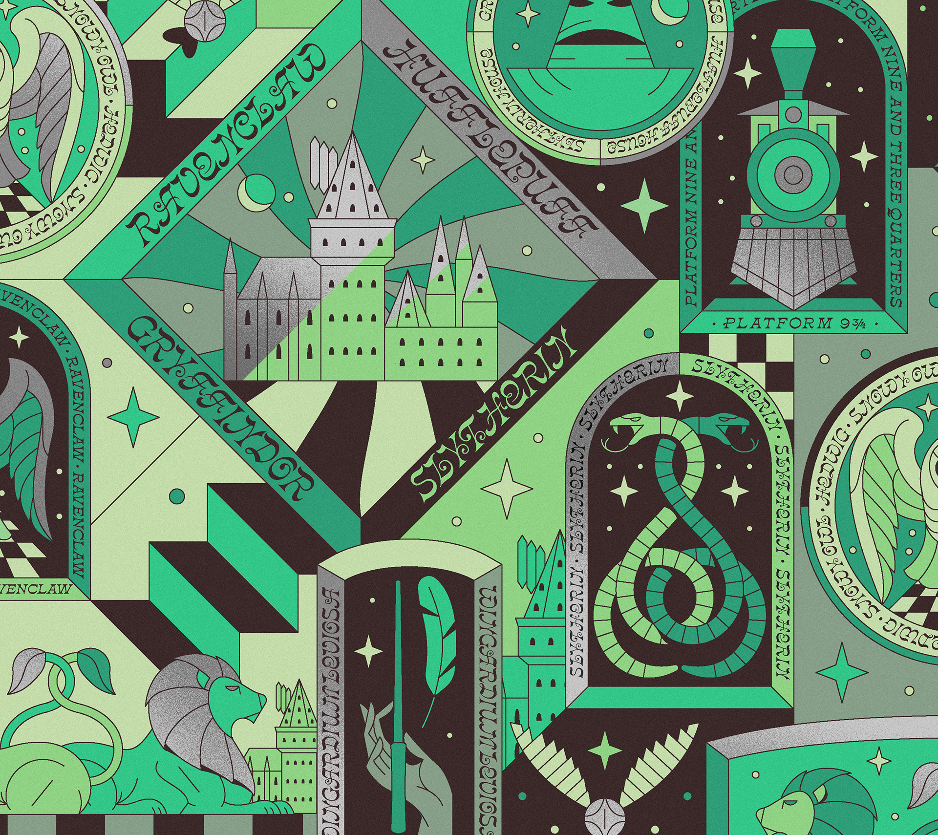
For this concept, I took the same badge idea and put a colorful twist on it; again, I didn't want the house colors to feel stodgy or antique, so I took brighter, and just off-hue shades of each house color and combined them into this colorful collage of Hogwarts references. Again, the primary deliverable was a pattern, which could be used flexibly throughout the packaging system. However, individual badges could also be used as accents or callouts when needed.

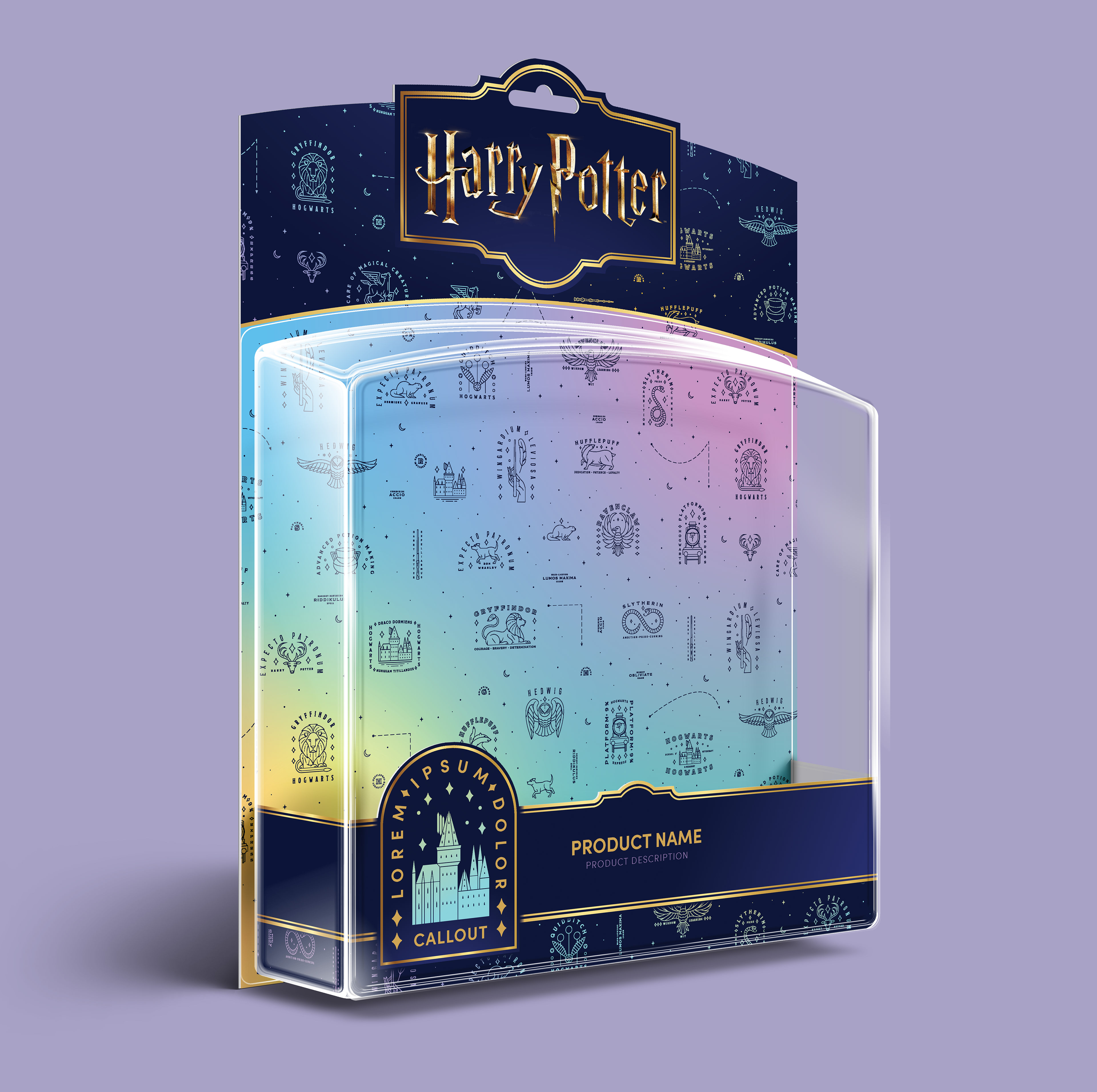
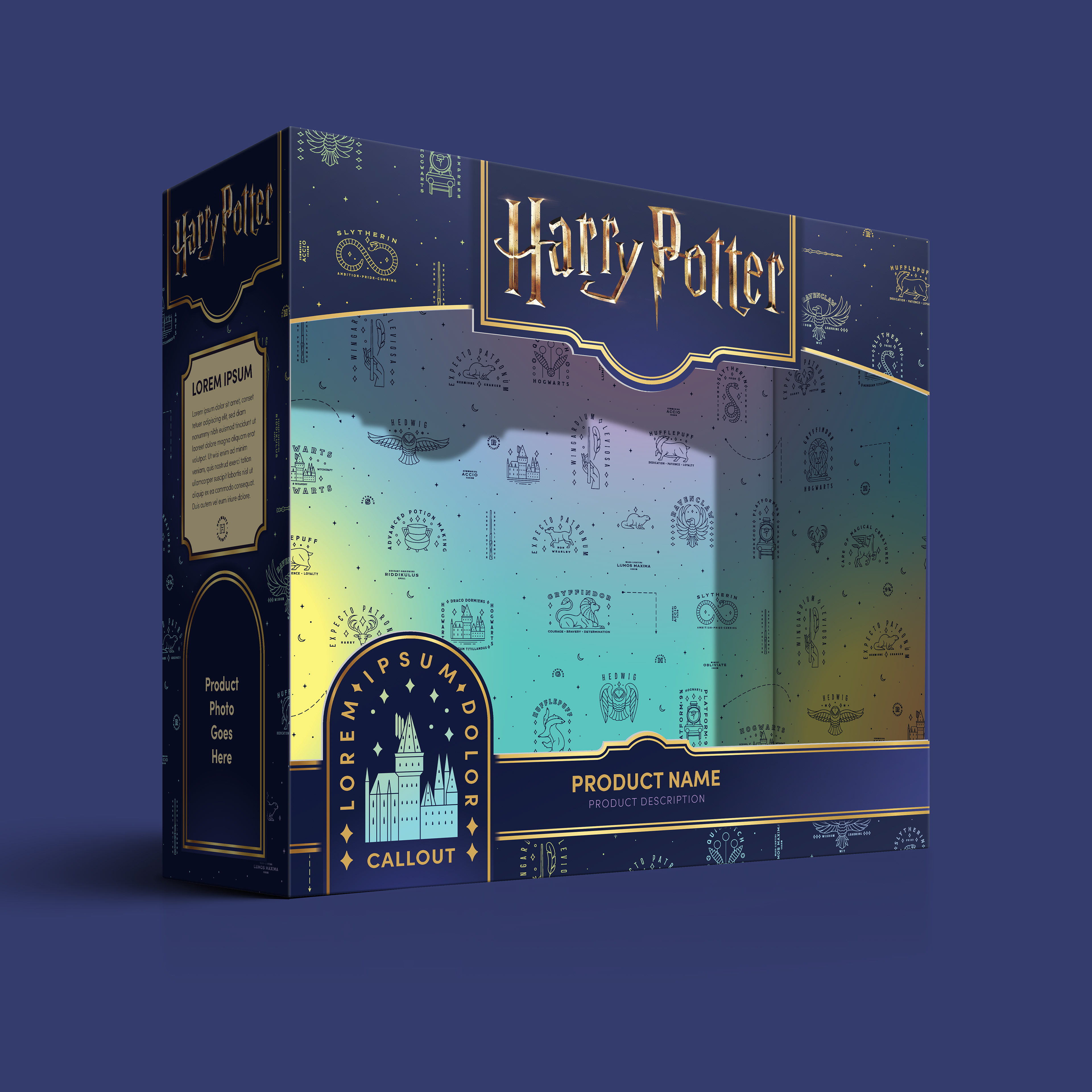
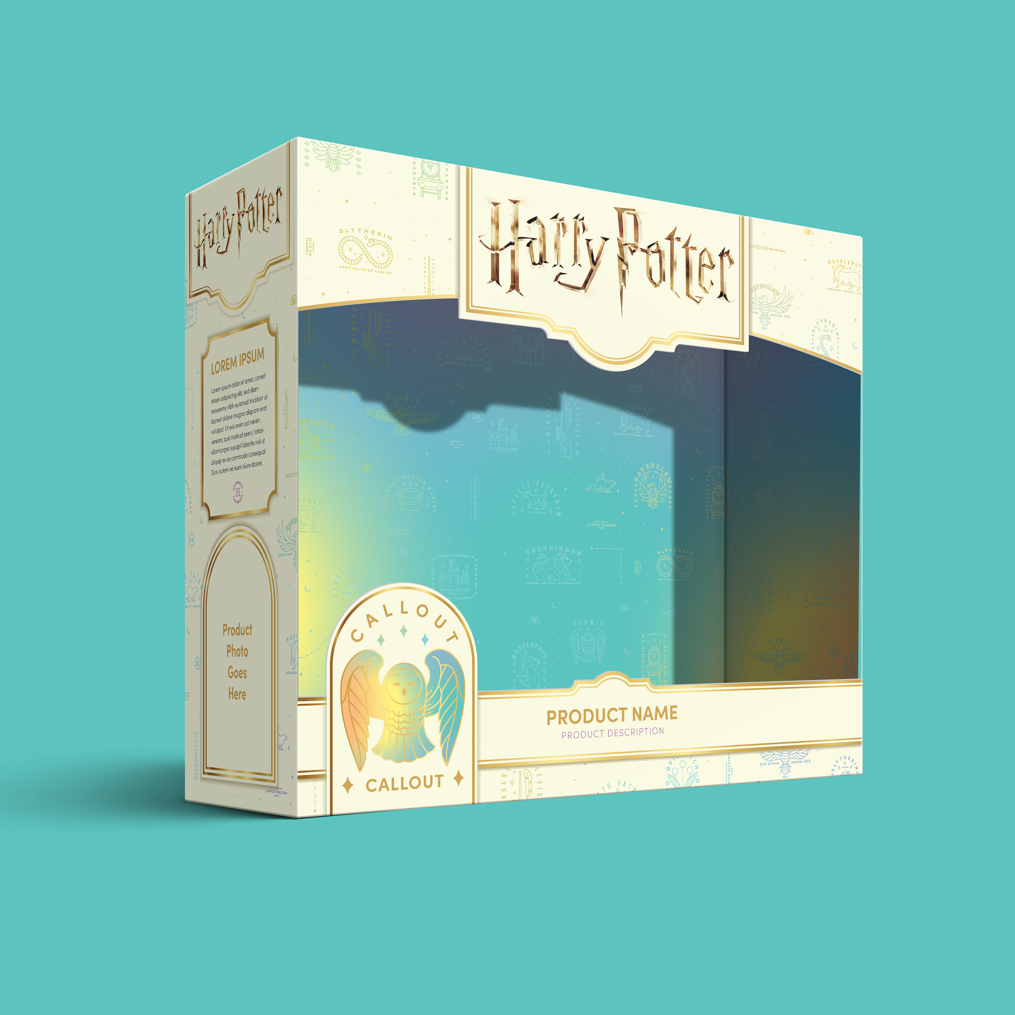
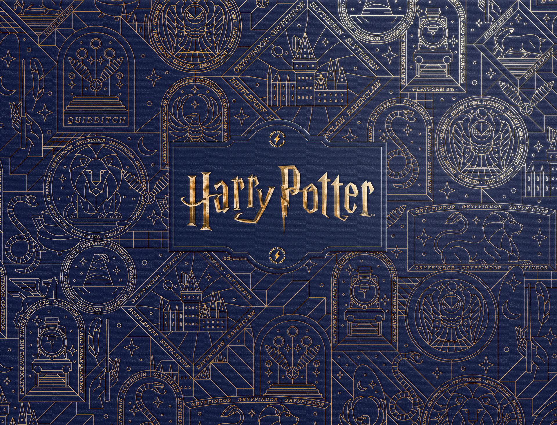
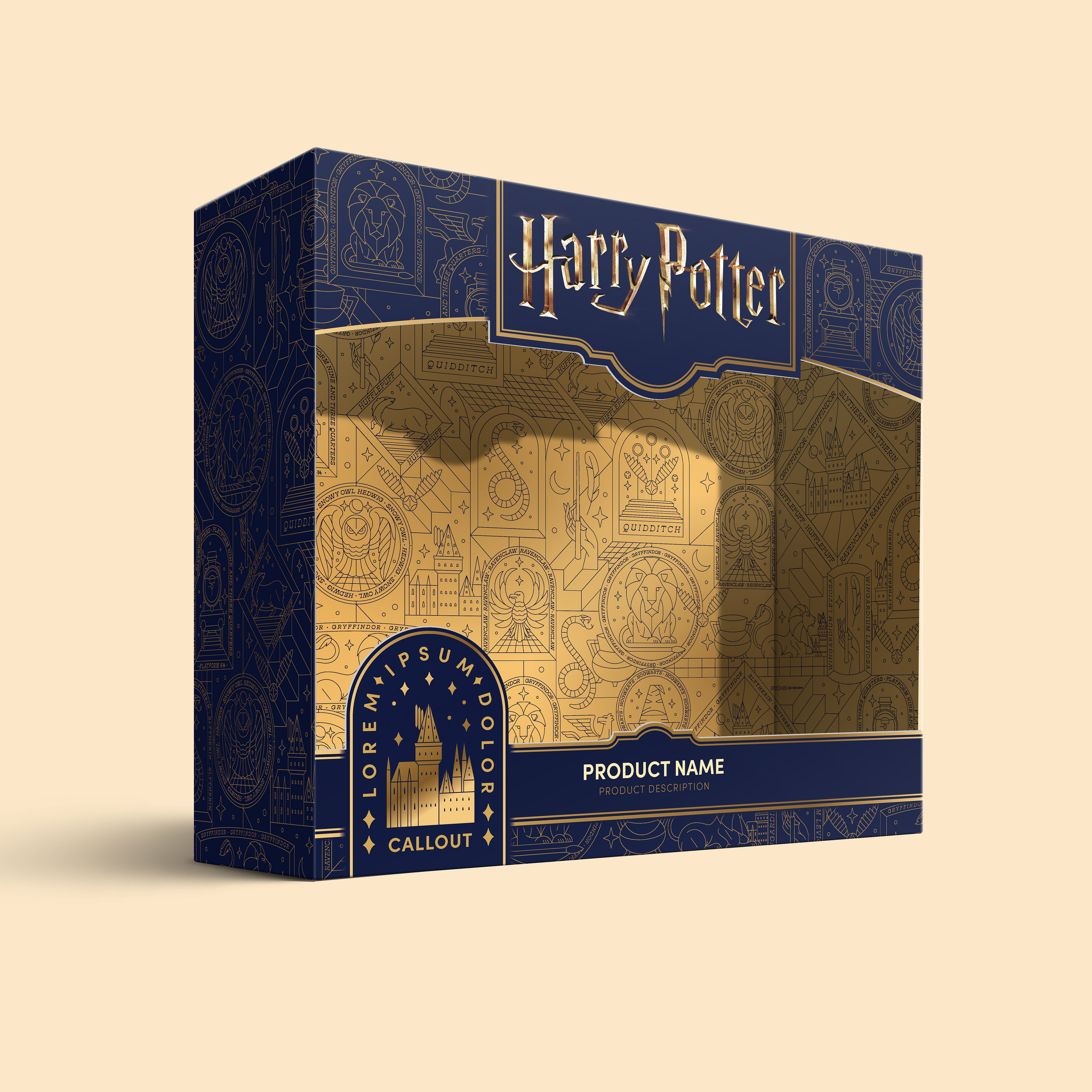
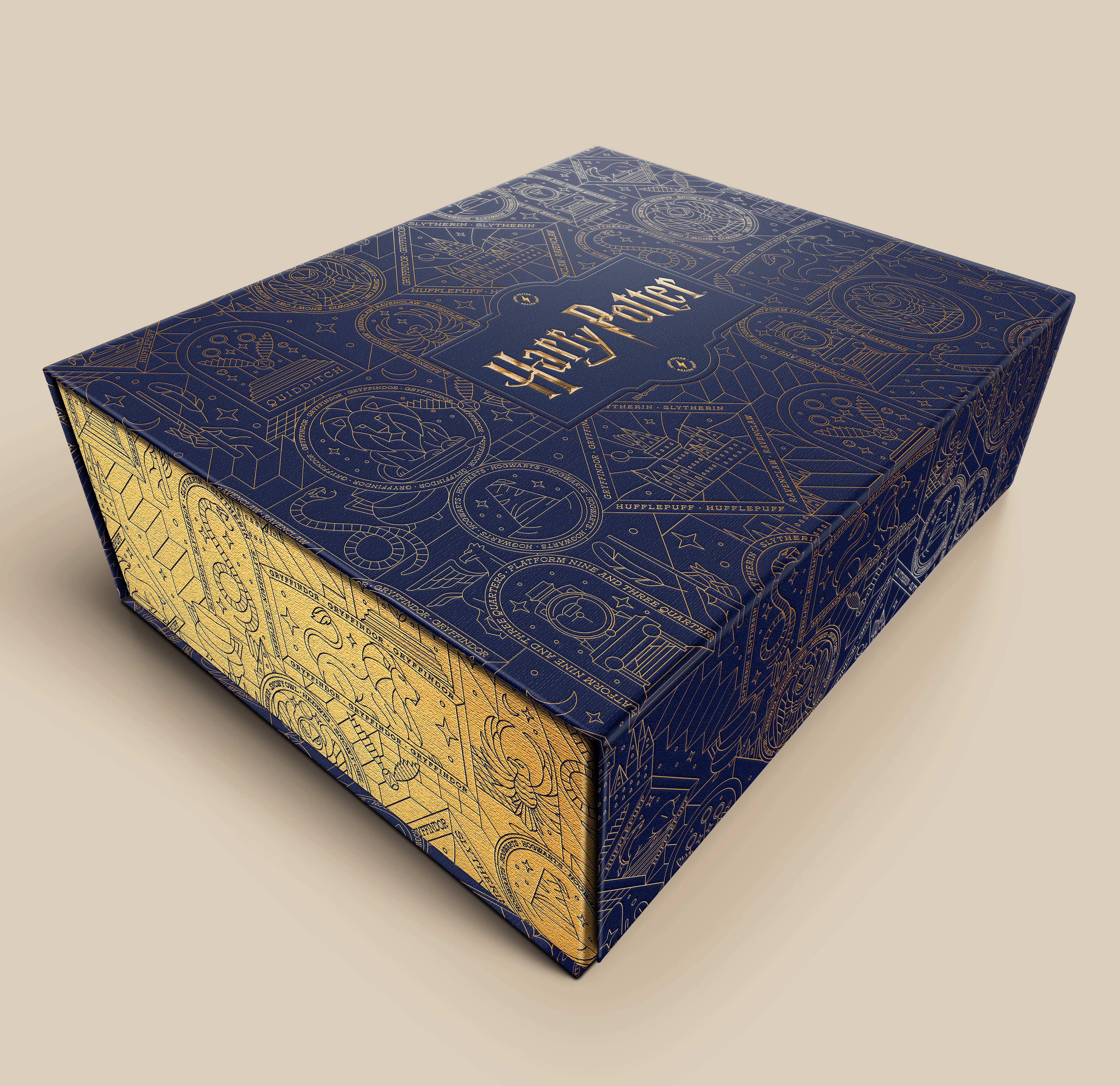
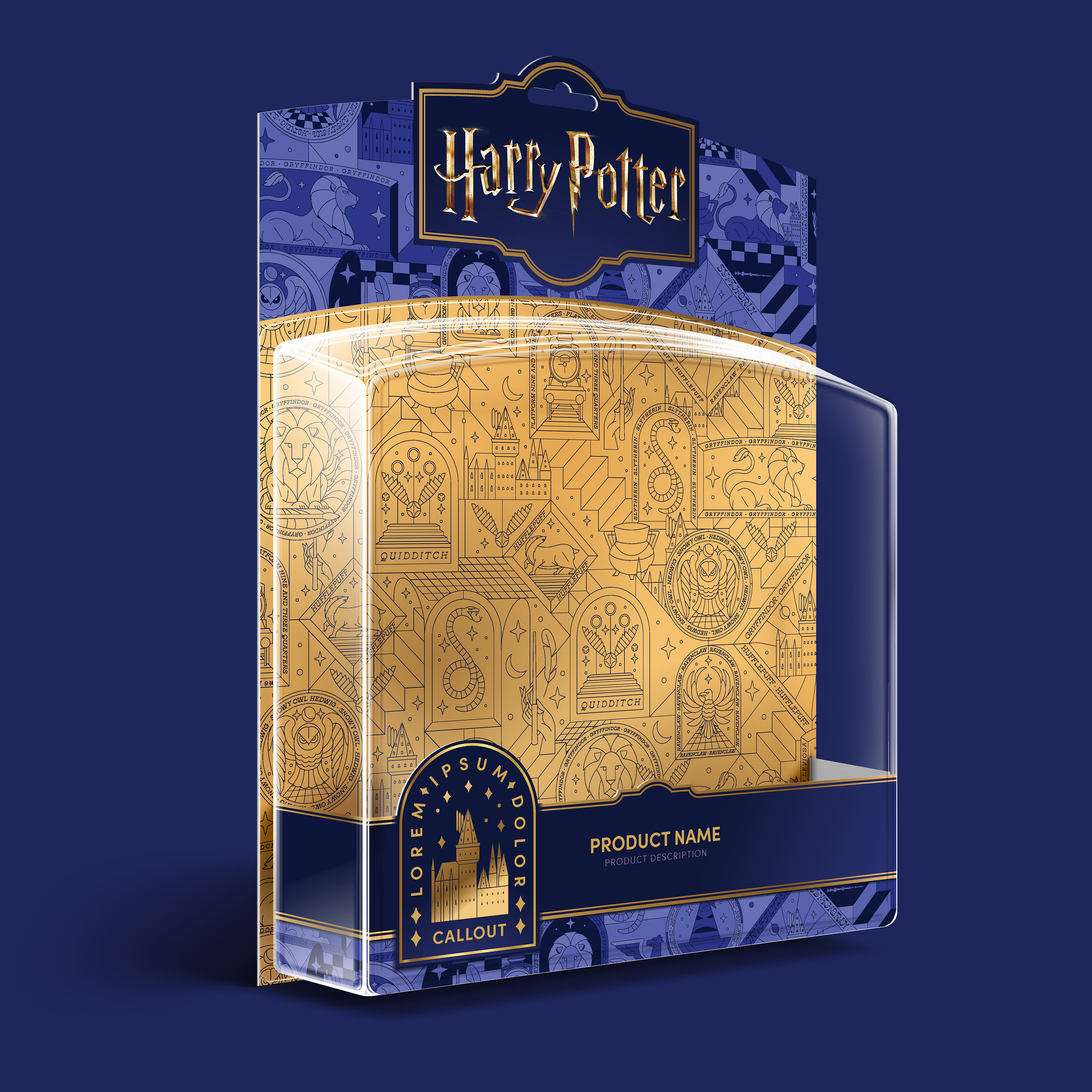
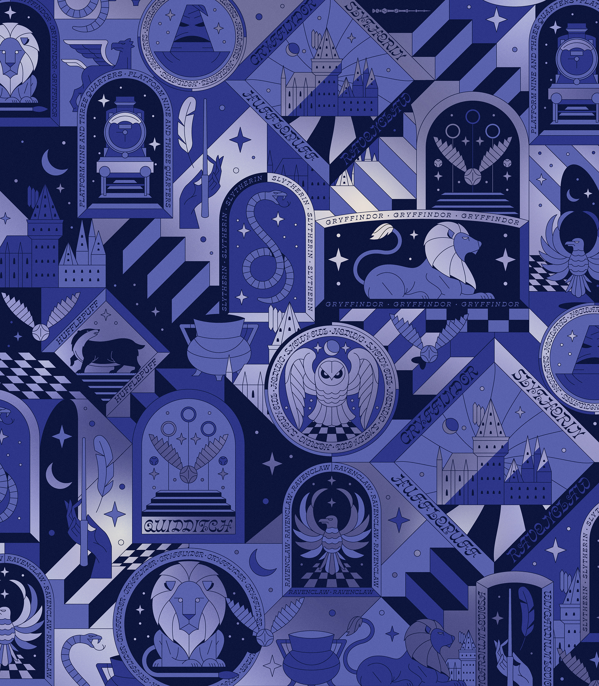
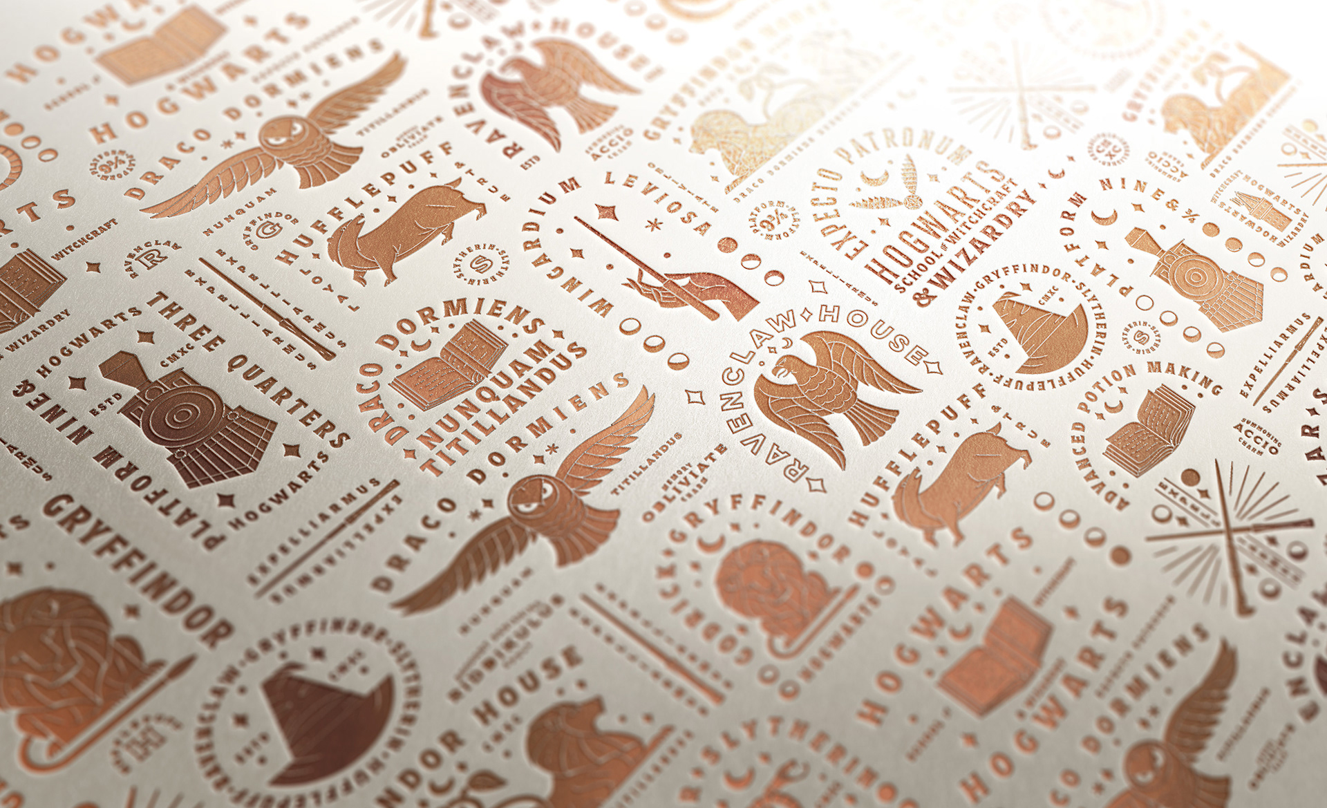
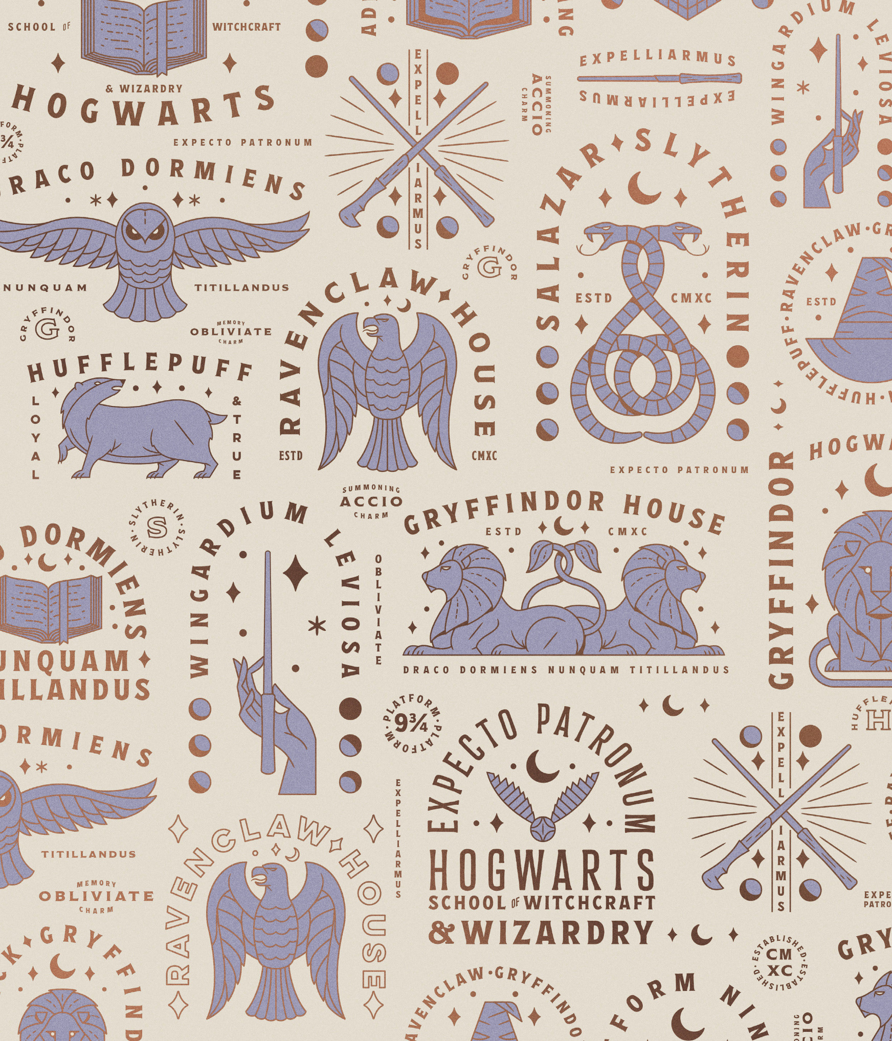
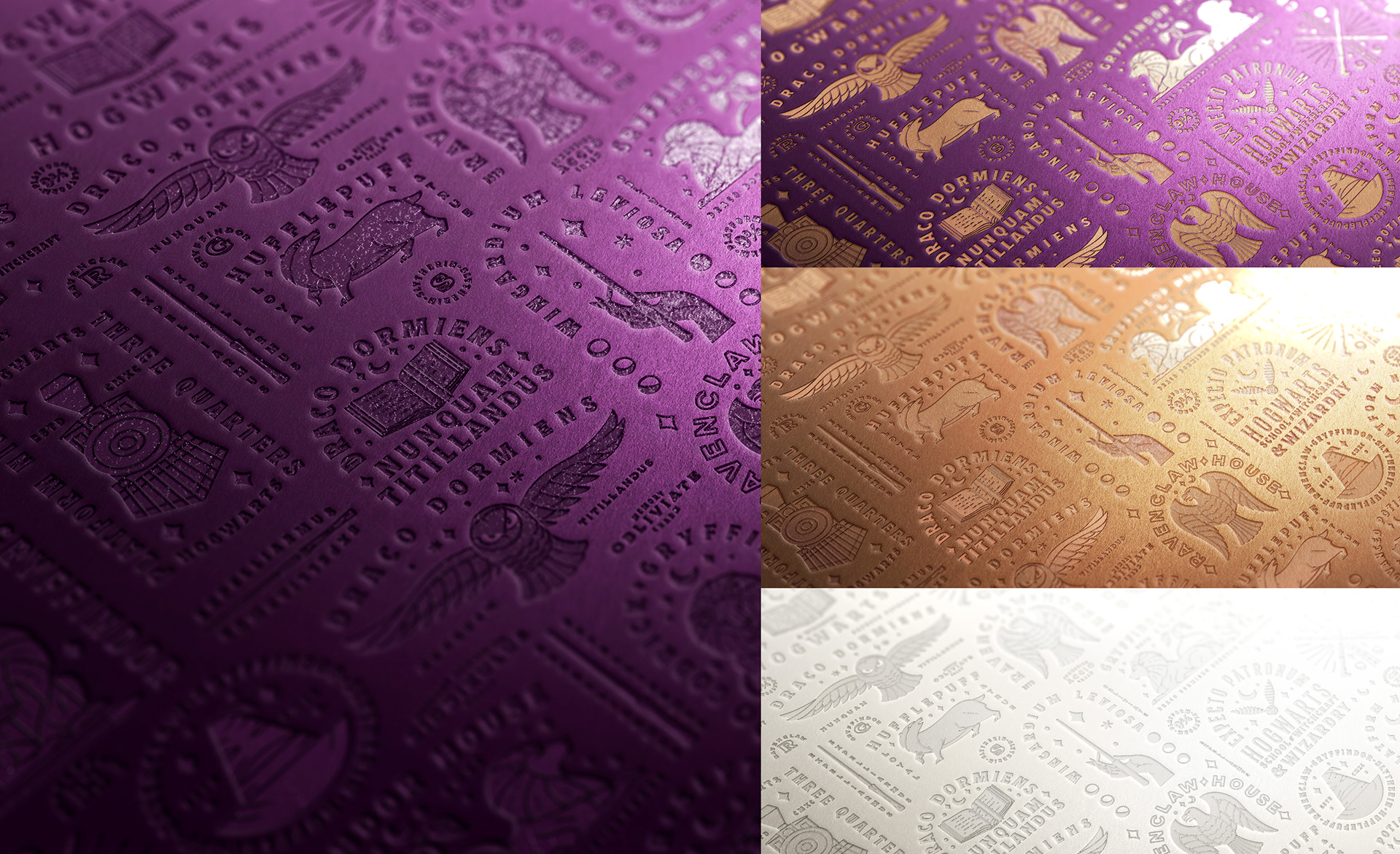
F I N A L A P P R O V E D D I R E C T I O N S
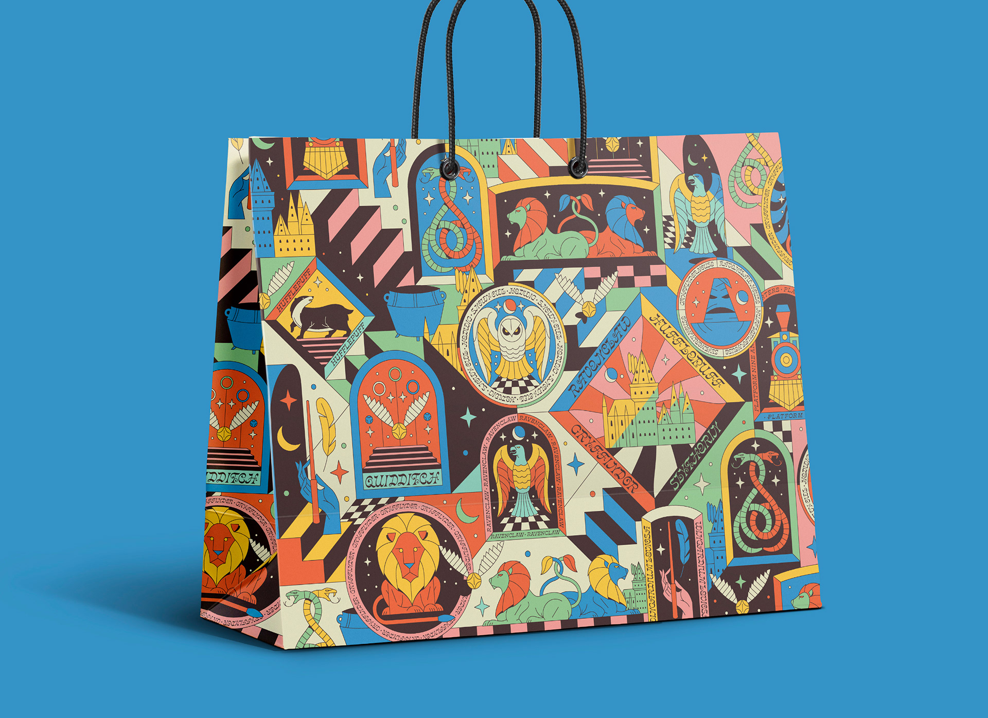
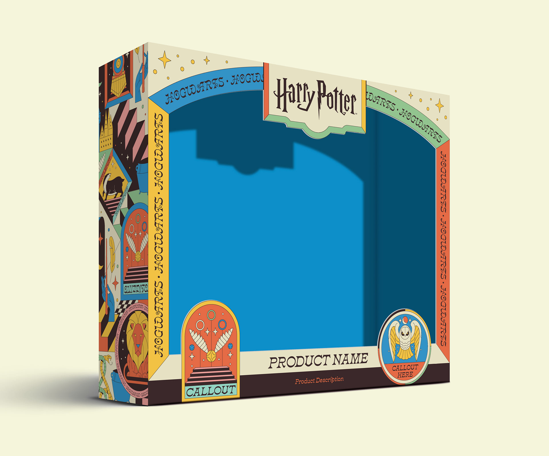
This was the final evolution, after many iterations, of the various systems and patterns that were developed. The purple became a deep indigo, and a holo-foil approach became the visual manifestation of the house colors. (Of course in reality, holo foil would likely only be used in more high-end packaging applications, but rather a printed gradient in most cases). A variant of the packaging (white) was also created specifically for toddler / infant products. Three fully unique systems were developed in the end, all shown briefly below.